Final Storyboard Proposal

After a long and thorough editing process, I have come up for with a final story board for the Ad/Pop-up corona virus PSA. To re-iterate, the goal of this pop-up is to encourage children from ages 4-6 to follow the corona virus precaution protocol in a kid-friendly way. A combination of research and advise from my professor led me to the following conclusion:

  • The cartoon has to be funny
  • It has to be from the child’s perspective
  • It has to have an iterative component
  • It can not scare the child
  • And its messages should be translatable through images only

So, how did I accomplish these goals. Well… lets take it one goal at a time. The first was for the cartoon to be funny and a young kids sense of humor is hard to cater too, but I decided that the best way was to turn the scary viruses into funny critters. Although the bacteria do not seem to play much of a role on the story board, that is because they can not move. Below is a sample of the close up bacteria misbehaving and will eventually be destroyed by the child in the pop-up animation. They will make little noises that symbolize them thriving outside, but dying when the water hits them. This will make the viruses not seem scary, but more like a game where all you have to get rid of them.

Animated Bacteria Clipart Gif
This would be an example for an animated germ that seems happy and fits the theme.

Now for the child’s perspective was a simple solution, the kid just had to be the main part of the simulation, with the viruses being the main supporting character. In addition, the child was made to be non-gender specific so they could apply to children of all genders and could relate and the family was made to be bi-racial so hopefully most races would feel represented as well.

The interactive component was also hard to illustrate using a story board, but is pretty simple where the child will simply press in order to do an action such as move on to the next screen, wash their hands, take shoes off.

Not scaring the child was probably the hardest part because to put it simply, I do not remember what scared me as a four year old. The only fearful dream I remember was being kidnapped by a duck cartoon in Target and being kept from my parents. I figures the concepts of deadly virus was not super comprehensible for them, but some nasty little creatures can be. In order to prevent this I chose to show two main things. First of all, I wanted to make sure that the creatures were not shown to be harming the child at any point, just simply sitting on the skin. I don’t think anyone, even a 4-6 year old would want green blobs on their body, so they should be compelling enough. Second of all, I wanted to make sure that the green blobs were always smiling. Yes, maybe that will send the slightly wrong message because the corona virus certifiably isn’t a pleasant visitor, no one wants happy green blobs on them either. In addition, when doing research on how to convince a child to do something, one obvious strategy was repetition, so ideally if the child saw the pop-up several times and the viruses are in most scenes, it should convince the child to follow the protocol.

Finally, a big edit I made was taking out the speaking component to the animation. It was decided that the words would probably be to complicated for the child to understand at such a young age. An option was to add audio, but then there would be no guarantee that the device would have sound, so it would just look too complicated. Speaking of sound, a good idea for the audio to keep a playful tone would be to have some funny cartoon music in the background. The link below is a sample of some cutesy music that would go well with the animation.

This music has a positive happy and also slightly clingy vibe!

Now finally, here are the scenes for the animation. Each scene reflects about 5 seconds and has the animation instructions below.

McInt, Leath, director. Cute Background Music. Cute Background Music, Youtube, 10 Sept. 2017, http://www.youtube.com/watch?v=0SjTHcaqlL8.

“Animated Bacteria Clipart Gif.” Clipart.Email, http://www.clipart.email/clipart/animated-bacteria-clipart-gif-66334.html.

Iterations

Since not very experienced, I had a lot of ideas for this pop-up “ad” any many of them I could not execute with out the technology in order to well, make a cartoon I guess. This left me trying to make the best of it using pen and paper, almost like a story board, but for an animated clip. The idea is that a child (non-gender specific in order to appeal to both genders) and their mother are walking home from the TOCA hair salon, a popular game that fits our age range. They pass a park and a pond before entering into their home, where the child will be prompted to execute the necessary precautions. It is important to point out that the goal of this animation is NOT to scare the child into following guidelines because that will just create unwarranted anxiety for the child. The animation will be more of a positive re-enforcing measure, where hopefully if the child sees the reinforcing measure which https://positivepsychology.com/parenting-positive-reinforcement/ says is an effective tool when teaching children. The scene will end with the child’s “family” having fun, indoors.

The images above represent the first rough draft where the first page is the child walking home, the second page is the child following precautions, and the third page being family time. An important point was to keep the word count on the pages as small as possible, other than some instructions on the animation. All of the words will also be said out loud in order to appease the younger audience that may not be entirely proficient in reading. The main words such as “SOON” and “SAFE” will be bolded and in a different color in order to stand out. The child will also be prompted to click on the different attractions, such as close the park or animate the animals in the pond. In scene 1 and 2 the child will be moving through the park and house in order to make it from their prospective. One issue was that some spaces seemed blank and extra, such as the rug in the second image. I also struggled with where to incorporate the aspect of not touching one’s face because it seemed out of place in the last image.

The images above represent the second rough draft. Other than going over the pencil in pen, a few more significant changes are made. One change was in the second scene where the dinner table was made bigger and took place of the carpet. This way I was also able to integrate the idea of not touching one’s face into eating dinner, which is also routine for a child. Ideally, there would be illustrated people sitting down at the dining table as the child gets to there, but this could not be shown on paper. Additionally, on the last page the section about the face touching was removed and the TOCA brand was incorporated since they would probably want to advertise themselves as well.

final? to be continued

The final draft will be digitized and will work out some imperfections, add color, and resolve some minor issues.

“Parenting Children with Positive Reinforcement (Examples + Charts).” PositivePsychology.com, 11 Feb. 2020, positivepsychology.com/parenting-positive-reinforcement/.

Corona virus ideas

Why this?

During this unique and sad time, it is important to remind the public that they should not panic, but follow the precautions that are suggest by the CDC. But, how do you get someone, with no medical training, and even little risk, to understand the necessity of following instryctions that they may not even understand. Thats right, I am talking about children. According to the CDC, more than 25% of COVID-19 patients do not show any symptoms, a big precentage of that being kids. Ofcourse it is goos news that kids are less likely to be affected by the virus, but what about the kids parents, or grandparents that are in close quarters with this child are likely to get infected. My solution? Well… although it is hard to admit, the main attention source of kids these days are their ipads and more specifically the games. So here is a little idea for an advertisment,ideally a donation from the games themselves, in order to encourage kids to

a. Wash their hands ALL the time

b. Not touch their face

c. And explain why they can not hang out with their friends

now the next question is… how?

How can we do this?

It all starts with some research on how to actually get kids to do things. For this, I went https://www.ahaparenting.com which may seem like not the most credible source, but I could not think of advice better than from parents themselves, which led to some important steps in order to get things to listen.

  1. Don’t start talking until you have your child’s attention
  2. Use few words
  3. See it from their point of view
  4. Engage cooperation

So, here is a preliminary idea. After a certain level is finished on a game, or when an ad is usually promoter, instead of the typical advertisement it will be the instructions on how to behave during the corona virus. This ad will be timed, but will use rhetorical methods applicable to children in order to get them to apply the instructions in their real life. One of these methods would be an interactive component and another would be having the simulation from their prospective (helps engage the child). In addition, there will be artistic elements that also work to engage the child, such as having the characters in the popup resemble the characters in the game. The specific targeted age range will be children ages 5-7 years old, meaning that they have some, but limited reading skills. The mock up will be done as Toca kids salon as the example game

https://www.amazon.com/Toca-Boca-Hair-Salon-3/dp/B01N6BNUU4

This game is meant for children from 3-7 years old which matches the target age range and has recognizable characters that can be easily replicated.

Photo Essay: Our Story

For the final draft of our story, we sifted through our photo collection and considered the possible stories arcs that they could create. While forging possible narratives, we were certain of the following details:

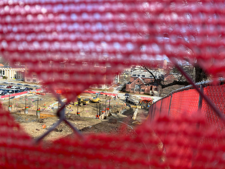
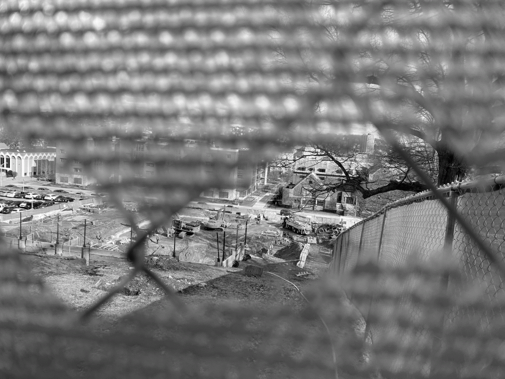
  • Our story should start with a look at the “Smart World” construction site.
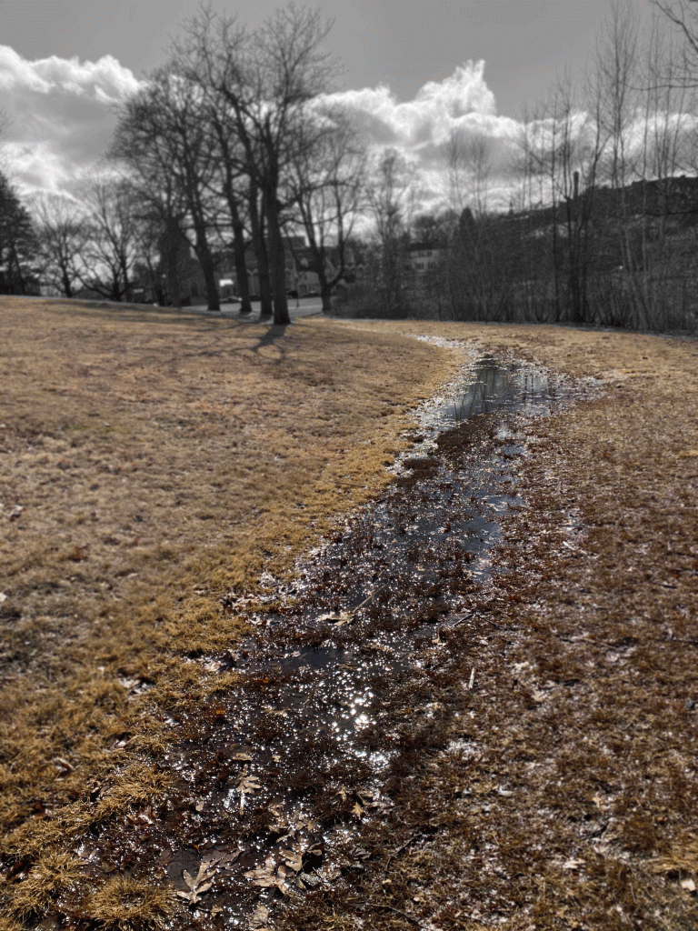
  • Our story should end with a look of nature in Institute Park and Salisbury Pond.
  • Our story should focus on the possible journey of pollution from the “Smart World” construction site to Institute Park and/or Salisbury Pond.

However, during this process, we were also unsure of the following details:

  • How our story should illustrate the motion of pollution between our beginning and ending shot (erosion, runoff, soaking into groundwater, a mixture of the three).
  • Ways that we could edit the photos through Adobe Photoshop that would emphasize the necessity for change without compromising the integrity of the photos.

In other words, we were certain of where we wanted the story to begin and end, but were also ensure of how to connect both points through a coherent story. To alleviate this issue, we itemized photos that could be used as our start point or our end point, chose which one would represent which point, and thought of common characteristics between both photos.

Another important set of parameters that we began brainstorming were the following:

  • Audience: Our audience is the WPI community, with a focus on WPI staff that are in charge of organizing construction.
  • Argument: WPI should slow down with its construction efforts and learn how to better utilize the space it currently has.
  • Purpose: Our purpose in assembling our photograph story is to emphasize the dangers of construction pollution as well as the necessity of maintaining good water quality.
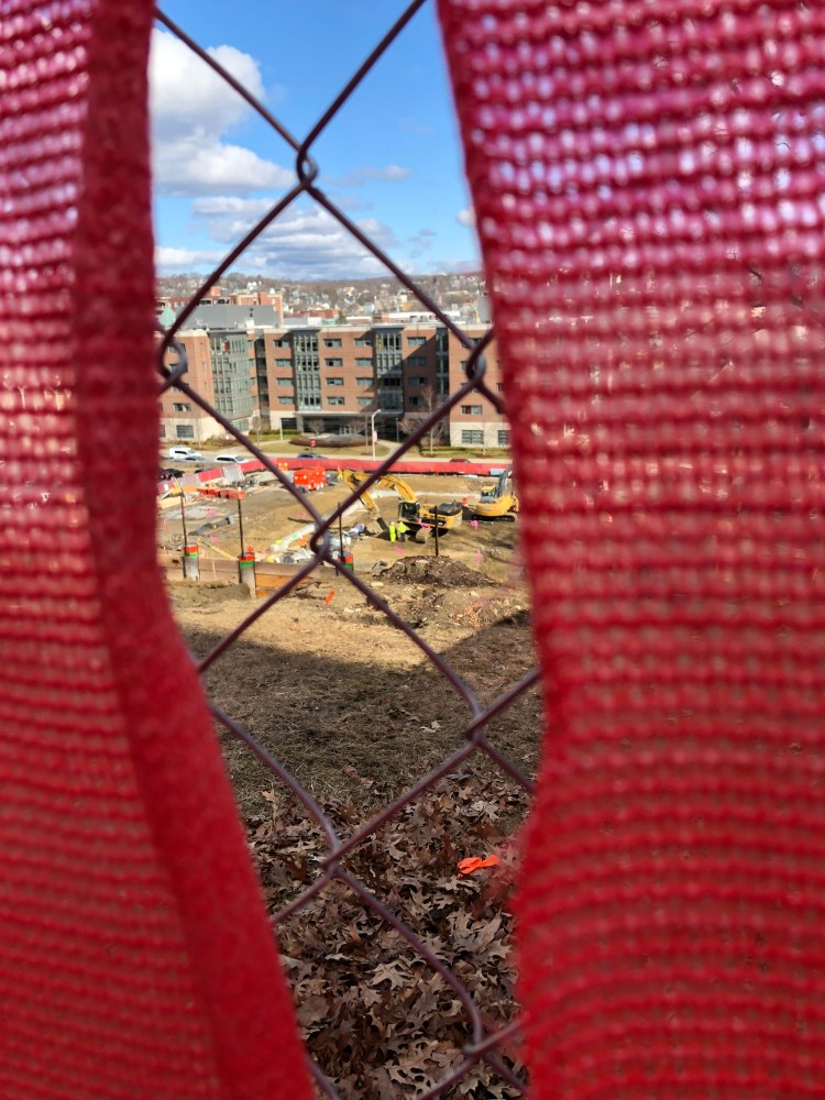
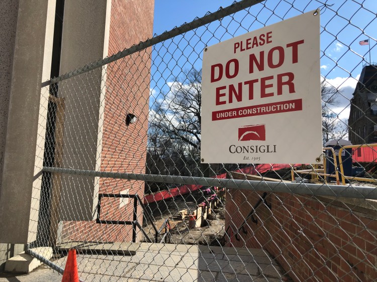
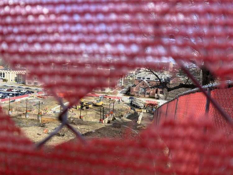
  • How: We’ll achieve our purpose by creating a story that showcases the journey of water from the construction site to Salisbury Pond. Unfortunately, since we cannot trespass onto the construction site, it’ll be difficult to emphasize the negative impact of the construction on water quality without getting creative.

Categorizing our shots by story position and setting them up side-by-side provided clarity on common elements between both sets that we could emphasize as a common thread throughout the panels of our story. These elements include:

  • Water
  • Construction
  • Nature (not focusing on water)

While assessing these three elements, we considered how enlisting them as our common element would benefit/hurt our story in terms of providing a profound look into water sustainability. Our thoughts on each entry were the following:

  • Water: We decided that utilizing water as the main element of our photos would be the most efficient way of cementing water sustainability as the main focus of our story. It’d be easy to find natural shots of water (as it had rained right before our photo shoot) and manipulate our shots to suggest a natural motion between our three body shots. However, we also felt as though it’d be difficult to make a profound statement about water quality/sustainability with shots that merely showcased water as its main element. Consequently, we’d need to experiment with ways/layouts that would create meaning without distorting water’s place as our main element.
  • Construction: We decided that utilizing construction as the main element of our photos would be the most efficient way of invoking an emotional response in our story. We rationalized this claim as juxtaposing construction sites with nature is an easy way to remind an audience of the life that populated a site before it was torn up. However, we also acknowledged the fact that it’d be tricky to incorporate this emotional response into a story about water sustainability.
  • Nature: We decided that utilizing nature (not focusing on water) as the main element of our photos would be the most efficient way of establishing a solid character for our story. Here, we rationalized that an audience would likely have an easier time following a person, animal, etc through a story rather than a complex structure like a construction site or a minor structure such as a puddle of water. Even so, we also acknowledged that focusing on an individual “thing” in nature would make it difficult to make a profound story about water sustainability without adding on a significant amount of text.

With all of these ideas in mind, we ultimately decided that we’d enlist water as the main element of our photos. Among the three options, it felt like the most consistent option for establishing a dialogue around water sustainability through a photo story without muddling the story’s message. In accordance with this choice, we looked through photo options that showcase water in a significant way. After some sifting , we realized that this collection of photos could be separated into three categories:

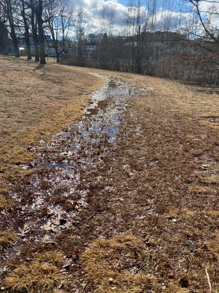
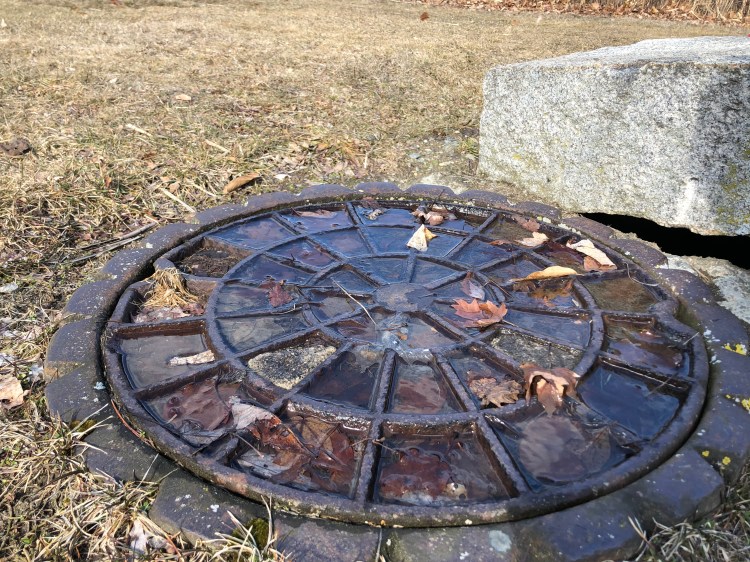
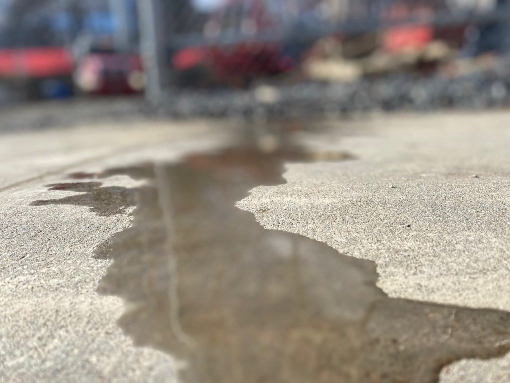
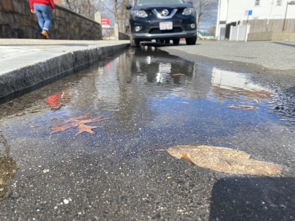
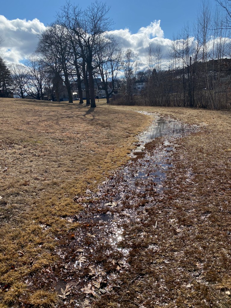
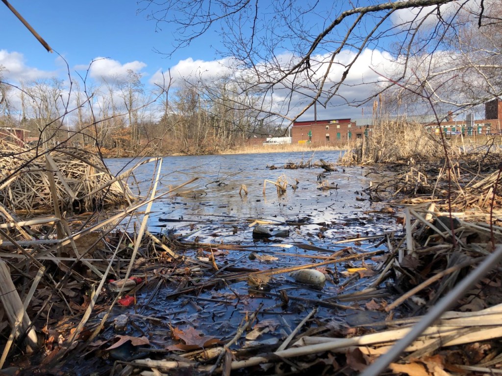
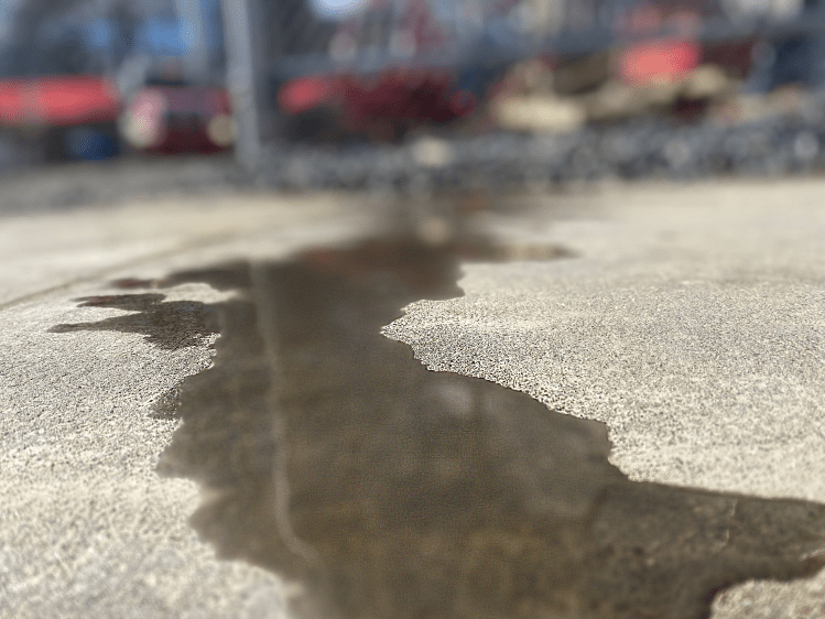
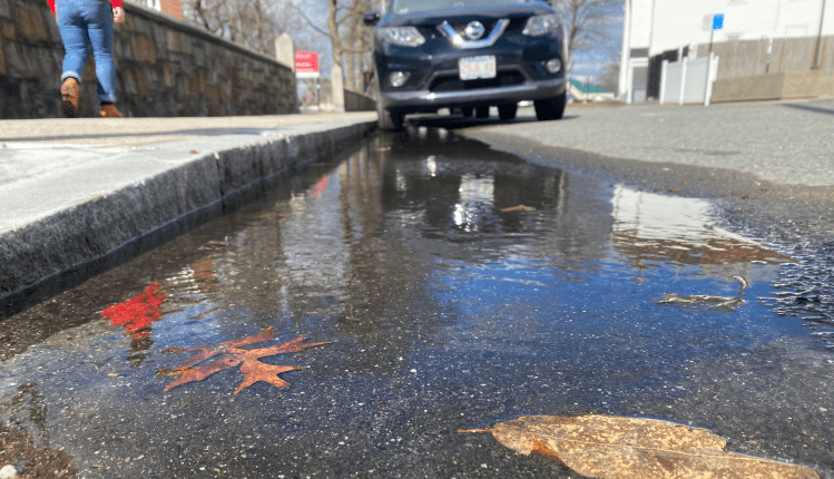
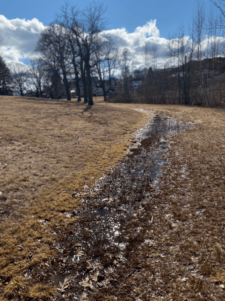
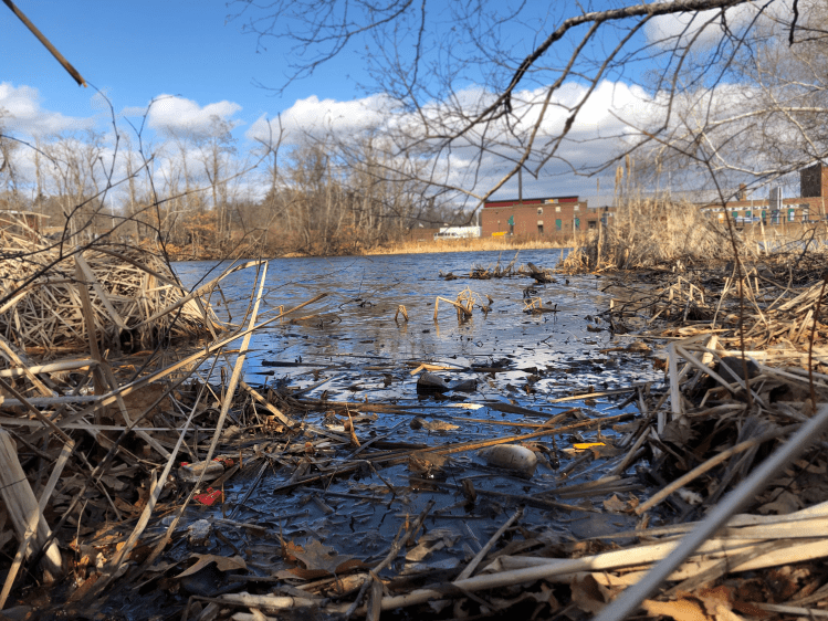
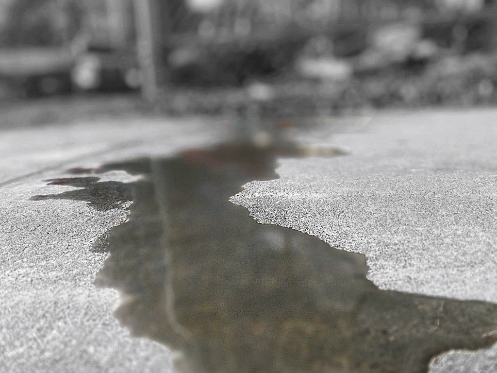
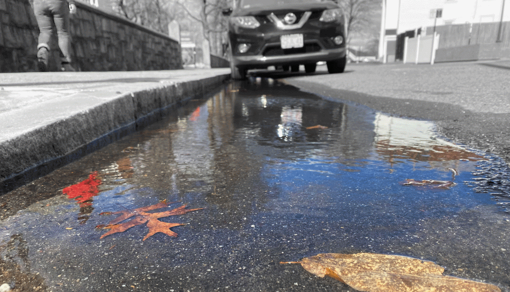
As noted, we separated our candidates for our middle three shots into whether they were taken by the construction site, Salisbury Pond, or somewhere in between. This separation felt appropriate as it’d be an efficient structure to showcase the motion of water from the construction site to Salisbury Pond that our audience, the WPI community, would be familiar with, given some visual context. With five locations in mind as well as a main character in mind, we sifted through our overall photo collection and identified the following five shots for our story:

After selecting these five shots, we opened them up on Adobe Photoshop and experimented with ways to adjust their coloring and focus in a way that’d emphasize water where need be. The following collection is a draft of our story in which we adjusted colors of various objects in an attempt to put a greater emphasis on water and its quality:

While some of our coloration changes felt significant, none of them appeared to make a significant difference to water’s visual significance in the story. Instead, other elements of the photo, such as the red fence in the first panel, are enhanced and steal water’s spotlight. Since this wasn’t our intended purpose in editing our photos, we decided on taking a different approach. The following collection is the final draft of our story in which we decided to shift our focus from minor color changes in our photos to major changes in the saturation of specific parts of our photos:

Our thought process behind cutting the saturation from certain elements in our photographs was to create an apparent juxtaposition between the first panel of our story, which illustrates the “Smart World” construction site, and our final panel, which illustrates Salisbury Pond. Between these two panels, our other photos become more much colorful as they transition from our initial panel to our final one. While we believe that this creates a progressive flow from colorless to colorful, we also wanted to establish a difference between WPI and the nature around it. Consequently, a majority of the elements that are WPI related are significantly unsaturated while water and non-WPI elements are left perfectly saturated.

If given more time to complete this project, we’d take the following actions:

  • Find a creative and constructive way of showcasing bad water quality without tampering too much with the base shots.
  • Highlight the “Smart World” construction site as the origin of said bad water quality and show a progression of water quality from the first panel to the final panel.
  • Experiment with other methods that construction pollution can travel from one place to another.

Photo Essay: some pictures

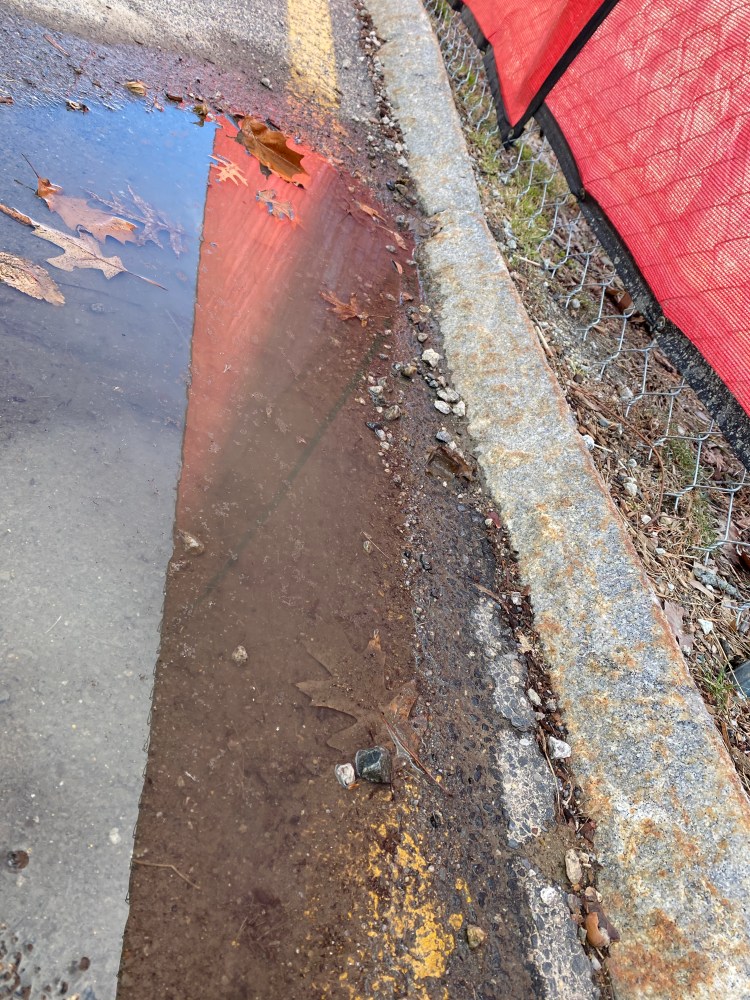
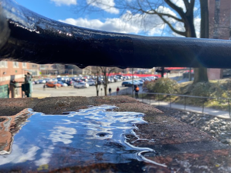
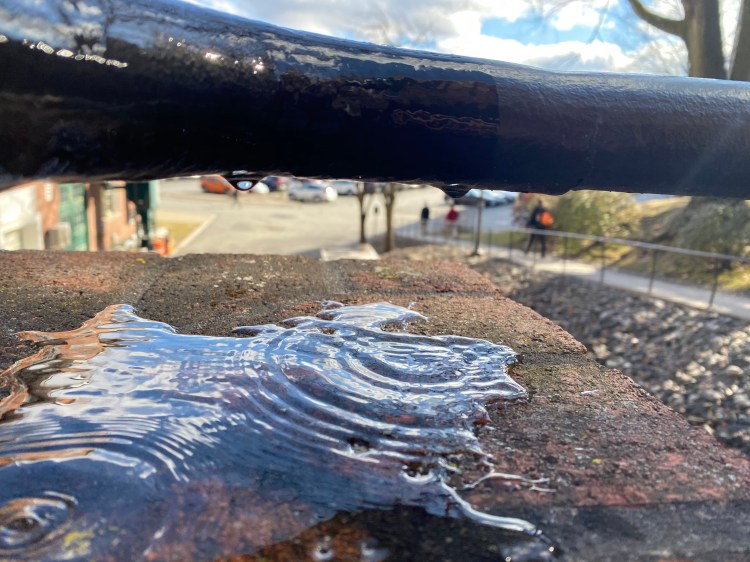
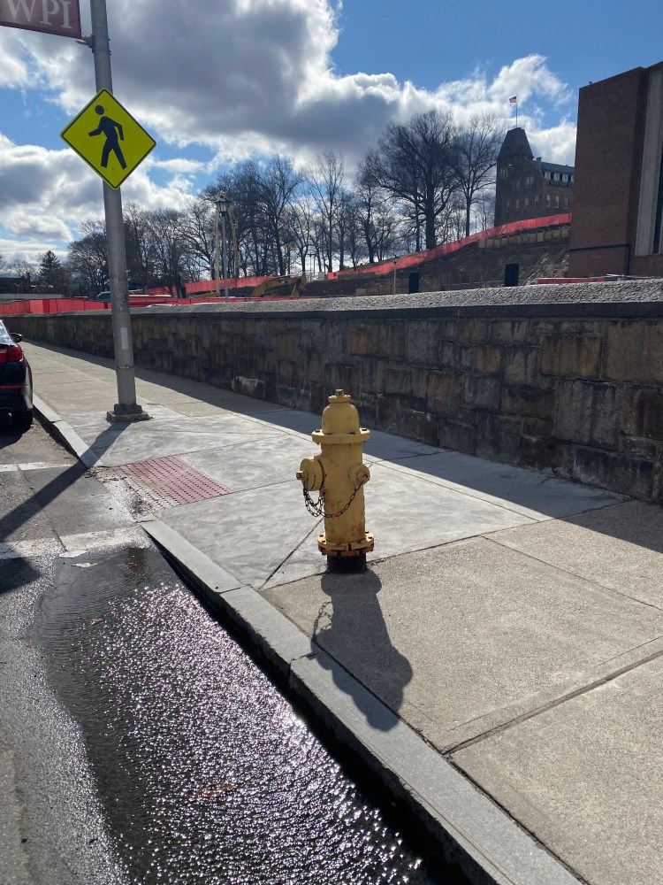
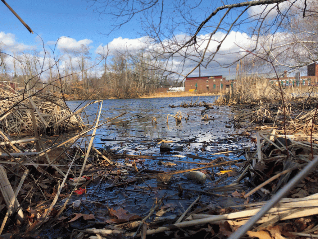
In this post we will be showing some different pictures that were taken with the theme of water sustainability and specifically the pollution of water with construction, specifically the construction of smart world at WPI. Before you can take a look at some pictures… a quick reminder of our audience and purpose. The purpose of our photo essay is to expose the damage that construction can do to the water quality in the surrounding area, specifically the building of smart world. Our audience would be the management that is in charge of smart world… so a little bit about that. After doing some research. According to Colleen Wamback, the WPI Smartworld building will be opened in January 2022 and is designed by a Boston based architecture firm known as Gensler and is coordinated with WPI president and provost Laurie Leshin and Winston Soboyejo respectively. Therefore, our main audience will be Laurie Leshin and Winston Soboyejo, but the Gensler firm will be slightly targeted as well. By demonstrating the dirtiness of the water that runs of from the construction and how it directly affects the wildlife around WPI (Salisbury pond). Anyways… here are some pictures that we took. Any favorites? Let us know!!!

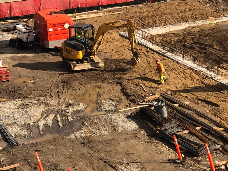
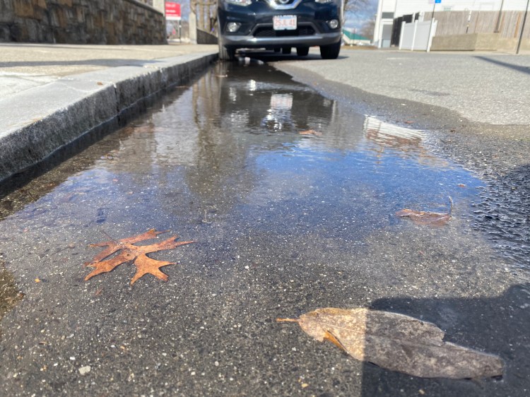
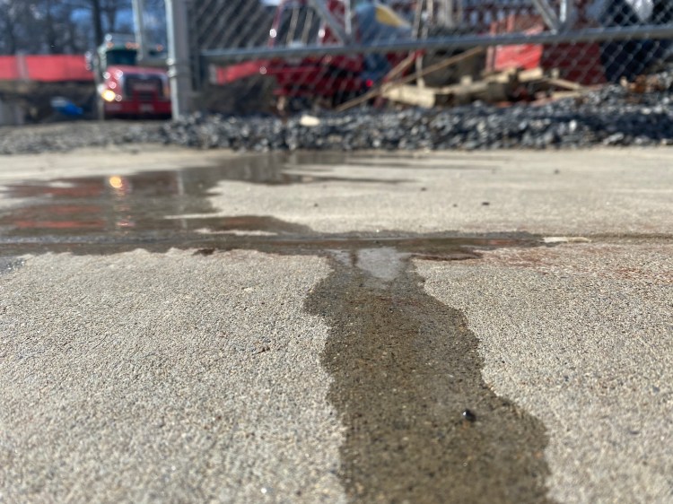
Here are some of the images we took in order to try and convey our message. Of course, the are all staged as we did not get a lot of rain this weekend, but all photos are staged anyways so there is no problem. Our main character across these photos is the water in order to show the pollution, but something we are struggling with is exactly how to make the water the main part of the image. Since we are not allowed to go into the site due to safety reasons, it is hard to make the water clearly noticeable from so far away. Any ideas how to make the water the star of these photos? Let us know in the comments!

Some questions

  • Which of the photos do you guys think is most compelling?
  • Are there any photos that should definitely be paired together?
  • Are there any photos that need specific editing or maybe a change in angles?
  • How can we make our story more clear?
  • As Arnheim said, both the photos and the captions should tell a story… That said, what kind of voice should we have in the caption. Encouraging? Disappointed?

Some sources

Wamback, C. (2019, October 4). WPI Breaks Ground on New Building. Retrieved February 29, 2020, from https://www.wpi.edu/news/wpi-breaks-ground-new-building

Arnheim, Rudolf. “Pictures, Symbols, and Signs.” Visual Rhetoric in a Digital World: A Critical Sourcebook. Boston: Bedford/St. Martin’s Press, 2004. 137-51.

Photo Essay: More Thoughts

by Noah Brennick and Alena Lukovnikova

Ever since being introduced to the project, we’ve been pondering potential topics and purposes to tackle in our photo essay. While coming up with ideas is easy, choosing one to develop an interesting story around has been challenging. Up until today, we’ve honestly been stumped. Even so, further research into sustainability and general brainstorming have guided us towards a potential path. The catalyst for this revelation was considering how the construction of “Smart World” impacts the WPI ecosystem.

Further Research on Sustainability

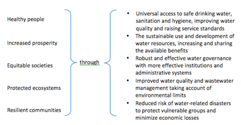
An issue we experienced during our initial researching process was that we viewed the photo essay as an extension of the comic book project. Consequently, we were looking into ways that the average student could make short term contributions to water sustainability. This mentality left us with a collection of generic ideas that wouldn’t be substantial enough for a 5 photo story. However, after choosing Smart World’s construction as the topic of our photo essay we decided to reevaluate our understanding of water sustainability. According to the United Nations, an integral step in improving water sustainability is to first improve water quality and wastewater management.

Securing Sustainable Water for All
Goals of Water Sustainability. (2015). Retrieved from https://www.un.org/waterforlifedecade/water_and_sustainable_development.shtml

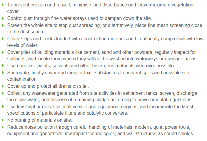
With water quality in mind, we began considering the impact that Smart World’s construction could have on local water sources. Further research, which was collected from sustainable build, informed us that “sources of water pollution on building sites include: diesel and oil; paint, solvents, cleaners and other harmful chemicals; and construction debris and dirt” (Gray). These materials make their way to water sources through erosion, surface runoff, and soaking into groundwater.

Our Photo Essay

With this new information in mind, we’re planning on focusing our photo essay on telling the story of how water pollution travels from construction sites to local bodies of water. Our audience will focus on the WPI community, with a focus on WPI staff who are in charge of overseeing construction jobs. By creating our photo story, we hope to stress the need of sustainable construction habits, which were also provided on the sustainable build website. If possible, we would also like to motion for a break from campus construction plans in favor of figuring out more constructive ways to use current space on campus without tearing up the environment.

Gray, J. (2020). Retrieved from http://www.sustainablebuild.co.uk/pollutionfromconstruction.html

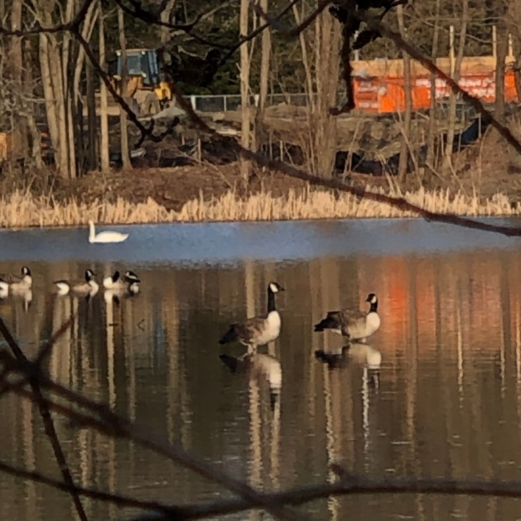
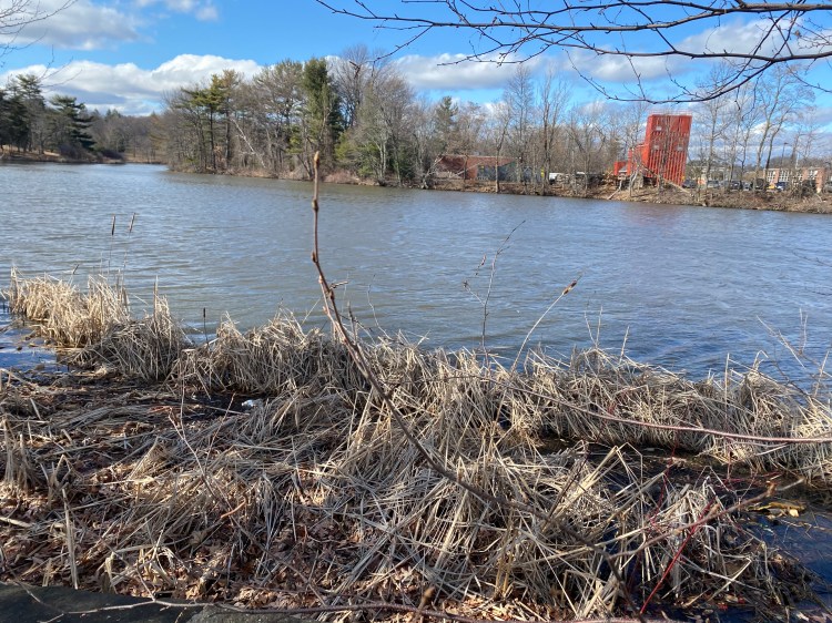
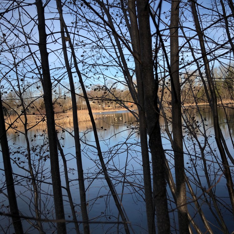
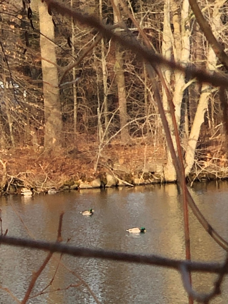
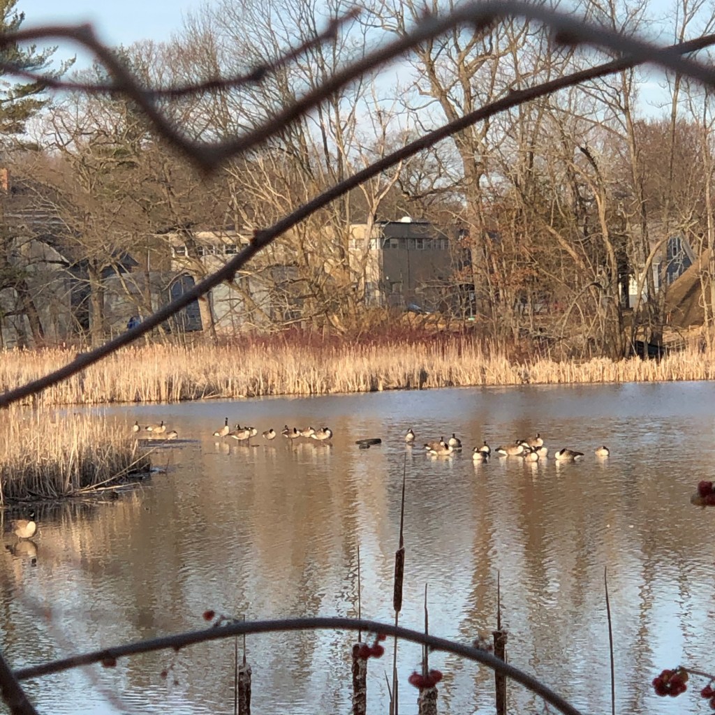
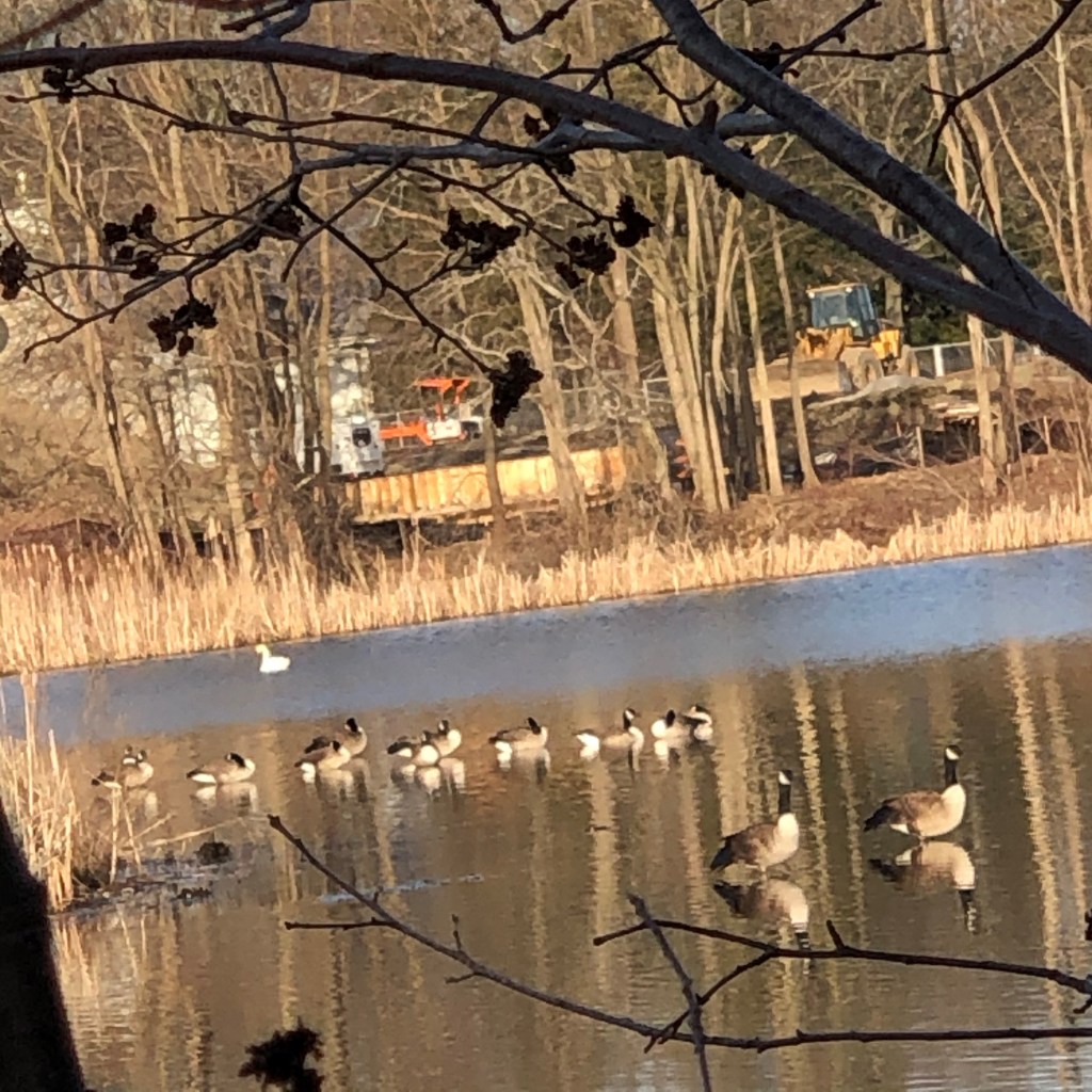
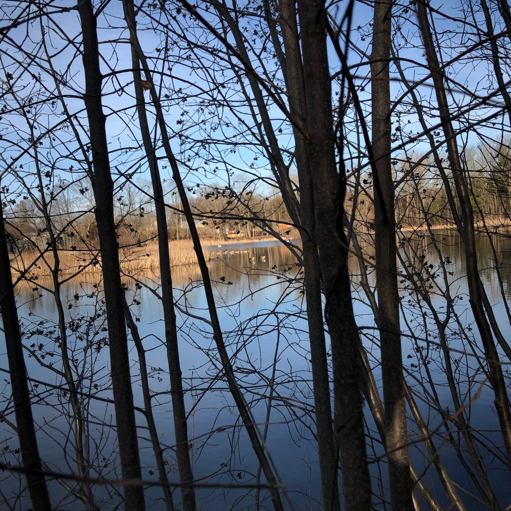
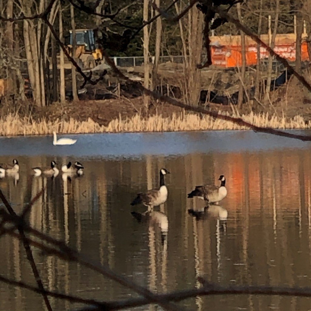
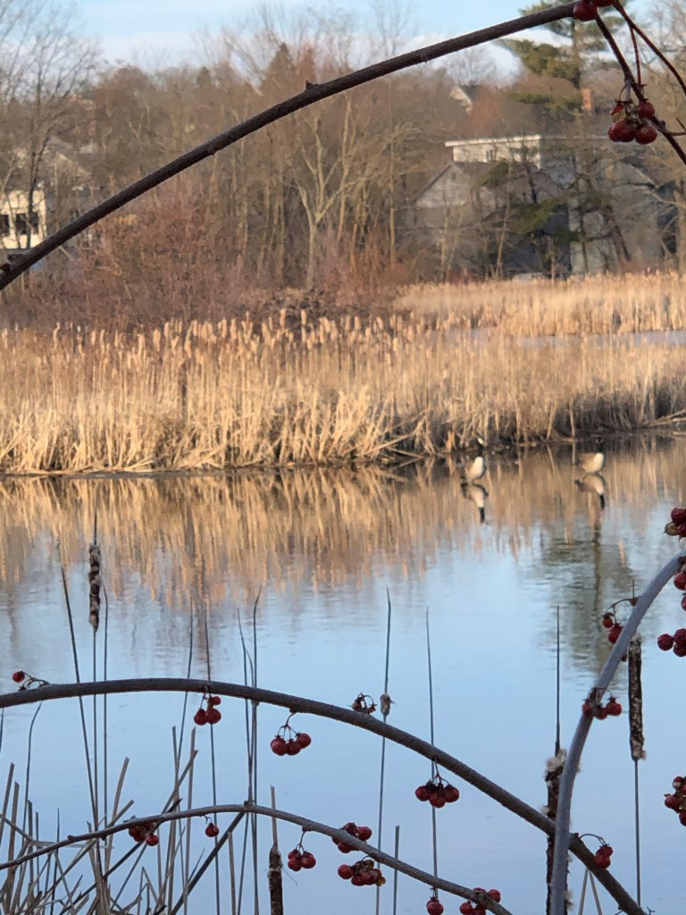
At this point in time, we haven’t taken too many photos. Our hope is to visit the construction site on a rainy day to help capture the movement of construction pollution. Although, we have collected some pictures from Salisbury pond that’ll serve as the end point for our story:

In taking these pictures, we wanted to experiment with natural frames that allow for a higher view of the geese. These artistic decisions were made to give the viewer an outside look at the pond that gives them a feeling of power. We hope that this effect will show the audience that changes on campus impact the environment around it and that it’s up to them to decide whether that change is constructive or destructive. It’s up to us to create a smarter world for nature to thrive in.

Questions

While we feel like our new plan is a step in the right direction, we have the following concerns:

  1. What’s a productive way to argue for better construction practices/use of current space without antagonizing our audience?
  2. How will we construct a 5 page story with a consistent character?
  3. How will we convey our intended purpose through our story?

Citations:

Photo Essay: some thoughts

Personally, I have never written a photo essay before and other than dabbling in a photography class my freshman year of high school, taking pictures was never really my thing. Never the less, I guess there will have to be plenty of research done in order to create an effective piece that accurately targets and the audience and conveys the true purpose, which by the way… we should probably determine now.

Audience and Purpose

For this photo essay we are specifically targeting the WPI students in order to encourage them to be more water-sustainable. Seems pretty simple… except when you get into the nuances. Especially, using photography to convey a message is a new concept and therefore plenty of research will have to be done, but for now lets go back to the audience. For students at WPI, their school is their home and where they spend most of their time and for this reason it will be important to use mainly pathos and truly hit the heart of the students. How can this be done? Targeting areas of WPI specifically in order to get students to realize that wasting water is effecting them and their home. This could mean exposing some unsustainable habits at WPI and showing how those habits ruin the school.

Research on Sustainability

After looking up how to be more sustainable, according to https://www.culligannation.com/10-ways-to-conserve-water-sustainable-living/ a lot of the methods revolve around “at home” life. This means saving water on long showers, not leaving the faucet running, and soaking dishes in warm water before washing them. This is not very applicable to the students at WPI because most of them live off campus and for this reason their “at home” water sustainability does not really effect the WPI community. For this reason, we thought that we should target the WPI students by showing larger unsustainable problems with the school, so they then go to faculty. This would be very effective because the WPI faculty listen to their students so hopefully the upset students will lead to changes around campus.

The photo essay part

How do you even write a photo essay? That is a good question that should be able to be answered with the reading we did in class and maybe some additional research. First of all, the photographs themselves. As Errol Morris mentions, posing a photograph does not get rid of its value. What are we gonna do? Sit and wait until the perfect photograph falls into our hands? If that method does not work for professional photographers,then it certainly will not work for us. This does not mean we will present any inaccurate information, more that we will just accentuate some truths. A good inspiration for an effective image is below.

Lukas Schultze/ Getty Images file

Citations

Morris, E. (2014). Believing is seeing: observations on the mysteries of photography. New York: Penguin Press.

Freeman, D. (2018, October 11). New climate report shows efforts to end global warming are falling short. Here’s how we can get on track. Retrieved from https://www.nbcnews.com/mach/science/new-climate-report-shows-efforts-end-global-warming-are-falling-ncna918121

Artist Statement

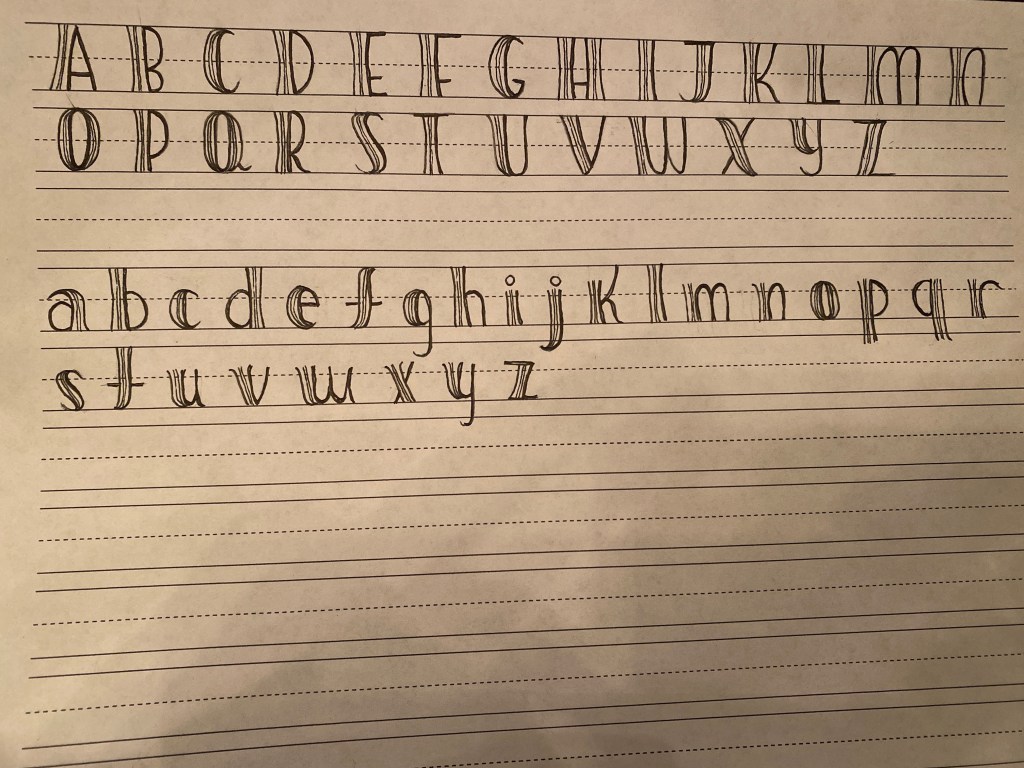
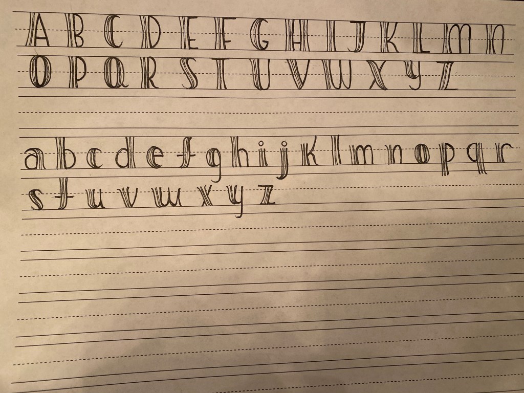
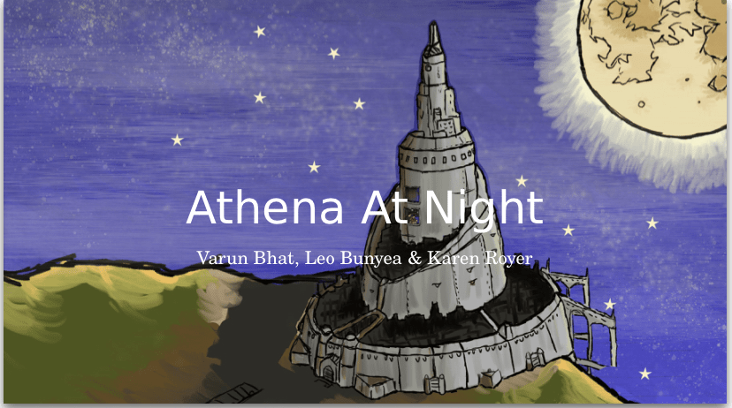
For this project we were tasked to design a font that would serve on the cover of a children’s pop up story book called “Athena at Night”. The book was steampunk theme and written mostly for young girls as the plot includes a driven princess that escapes her way out of the castle. The final font that we chose to present is pictured below and we chose to call it spunk as a play on “steam punk”

            The font we chose was created to serve two main purposes: one being the audience of a female child from ages 5-9 years old, and the other being for the font to fit the steampunk theme. After making several conscious and purposeful choices we feel like our font truly fits on the cover page of “Athena at Night ”. The way we were able to entice the young female audience was through maintaining a more feminine font and trying to steer away from the obvious gears and bolts that could potentially be repelling to the audience. For this reason, we were forced to explore more representations of steampunk and specifically the Victorian era. After research, we found that we could use the fashion of the era in order to represent the steampunk theme. Specifically, we focused on the corsets that were worn by most women at the time, and stripes that were worn by both genders. We wanted to make sure that the font does not take away from the artwork of the cover page, but still fits into and alludes to the steampunk style. Therefore, we decided to make the thicker part of our letter shaped as a corset, meaning both sides would just slightly come in at the middle. In addition, we added two lines at the center of each letter to allude to the back of a corset where it comes together and the stripes that were worn at the time. This detail was chosen to be subtle because we did not want to turn our letters into corsets or specific clothing items because that is not the theme of the book and the connotation that corsets have today does not apply to the audience of the storybook. Still, by adding these subtle yet considerate details our font is able to add to the steampunk/victorian aura without the it being a distracting element. Other purposeful decisions we made included slightly bolding the base of the letter and drawing the font by hand. We chose to bold the letters so that from far away, the letters were still easily visible and so that children had an easier time differentiating between them since their reading skills at the target age are still inadequate. The letters were hand drawn to match the style of the art work in the book. Although the artwork was made on a computer, it was still hand drawn and it was clear that the images were not computer generated. Since we did not have the resources of an electronic pen, we believe drawing the font has the same effect where the letters look slightly more ragged and authentic. Overall, we are very happy with our final design and feel as if the font truly fits the criteria that the authors were looking for.

Our Final Font

The Dots…

For our final font, we needed to make important decisions on key details of our font. One element that we are still very worried about is the details around the multiple lines that would represent the steampunk theme. Although we already came up with a very detailed idea of our font, some last-minute edits were needed. One thing we needed to decide was the size of the dots and the uniformness. We do not want the dots to clutter the space in between the lines and make the font too “busy” since we want our audience of 5-9 year olds to be able to easily read it. Another element we need to keep in mind for the dots is how they look on the detailed cover. Since there is so much artwork on the cover, we must make sure that the dots don’t take away from that. After a lot of thought, we decided to go back to our original idea and ditch the dots. Since they would be so small on a such a complicated background we decided they were not necessary. We initially had them to add steampunk reference, but with the curvy letters we still represent the corset theme and the lines represent the stripe theme seen throughout the Victorian era.

Specific Letters

 Besides the overall theme of the dots, there was nothing left to do but specifically change some letters. Initially we were planning on keeping all the letters in uppercase, but as we worked through each letter, we started to see that lowercase tended to fit the overall theme better. But since we still wanted to keep a couple letters on the cover uppercase, we decided to create a font with lowercase and uppercase letters. This meant we needed to design entirely new letters. One specific letter that needed work was the T. Since the letter T is going to be featured three times on the front cover it is important that the audience gets the exact rhetoric we are trying to display. In our last blog post we had an uppercase T, yet it was not extremely legible. It was clearly a T but it did not stand out like the other letters did due to the thin line that run across the top. A way we chose to fix this was change it to a lower-case T so that the line runs across the middle and it becomes more symmetrical. This also allows the T to become a little curvier, yet again increasing appeal to young females, the targeted audience.

 Another letter that we needed to fix was the F. As an uppercase letter it looks very straight and does not fit the rest of the letters very well. When using it as a lowercase letter we were able to make all the ends much curvier, yet again attempting to appeal to the target audience. Not only did the lowercase version have the theme better, but it also was subjectively more aesthetically pleasing.

This was our final font. We are very happy with how it came out because not only does it fit the steampunk theme very well, we think it will fit the entire aesthetic of the book and grab the readers attention.

Step 3: finalizing our design.

Decisions, Decisions, Decisions

As the design process is slowly coming to an end, we begin to realize that it is time to have an idea on what our final font is going to look like, which means making crucial decisions so that we can spend time perfecting our font instead of constantly changing the details. The struggle we have been having is relevance to a steampunk theme and tying it to the Victorian era. We can not let the cover speak for itself because as Paul Gutjahr says in “Introduction: Reading the Invisible”: “literary texts are no less “marked” by their typography than more commercial 01 functional texts” meaning that if we pick a plain font, it will still send a boring message.

While trying to take the route of tying our font to the fashion of the era, we aren’t sure if out font is quite hitting the steampunk theme we are trying to convey. This post will focus on finding the flaws in our own design, as we search for solutions and ask for advice.

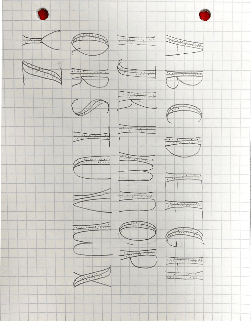
The font above represents our most recent draft and although it is obvious that it is a draft, it is a good representation of our recent ideas, as the corset shape is meant to symbolize the Victorian era.

Specific Details

One of the aspects of out font that we are unsure about is weather or not the dots (which are supposed to represents the loops of a corset” really serve that purpose, or if they are irrelevant and distract from the theme. The letters are going to be on a dark background, but the background of the cover page is an intricate picture with lots of details and the dots are likely to get lost in the background. On the other hand, delicate designs is a theme throughout the art of the storybook and big bulky letters do not fit the aura that the text gives off.

As you can see, the title above does have plenty of detail, so it is important to keep that in consideration when evaluating who meticulous the font should be.

We also had trouble getting specific letters to fit the corset theme. For example, letters that are curvy are less likely can not be curved even more to make a corset so to me, they look more like a watermelon. One idea was to make the letters less uniform and not introducing the corset theme into every single one, but we can not decide if that would be awkward. How can we incorporate the theme?

Final Thoughts

While we have some problems to solve, we feel confident in the direction we are going in. Since the criteria was so broad, there we many directions that we could have gone in and the direction we chose incorporate the audience and the steampunk theme that the authors intended. The next day we will take to finalize the font and really focus on the minute details to make it look finished and professional.

sources

Gutjahr, Paul C., & Benton, Megan L. (2001). Introduction: Reading the invisible. Paul C. Gutjahr and Megan L. Benton, Illuminating letters: Typography and literary interpretation (pp. l-l 1). Amherst: University of Massachusetts Press.

Create your own website, free on WordPress.com.Create your own website.
Start free