The Dots…
For our final font, we needed to make important decisions on key details of our font. One element that we are still very worried about is the details around the multiple lines that would represent the steampunk theme. Although we already came up with a very detailed idea of our font, some last-minute edits were needed. One thing we needed to decide was the size of the dots and the uniformness. We do not want the dots to clutter the space in between the lines and make the font too “busy” since we want our audience of 5-9 year olds to be able to easily read it. Another element we need to keep in mind for the dots is how they look on the detailed cover. Since there is so much artwork on the cover, we must make sure that the dots don’t take away from that. After a lot of thought, we decided to go back to our original idea and ditch the dots. Since they would be so small on a such a complicated background we decided they were not necessary. We initially had them to add steampunk reference, but with the curvy letters we still represent the corset theme and the lines represent the stripe theme seen throughout the Victorian era.
Specific Letters
Besides the overall theme of the dots, there was nothing left to do but specifically change some letters. Initially we were planning on keeping all the letters in uppercase, but as we worked through each letter, we started to see that lowercase tended to fit the overall theme better. But since we still wanted to keep a couple letters on the cover uppercase, we decided to create a font with lowercase and uppercase letters. This meant we needed to design entirely new letters. One specific letter that needed work was the T. Since the letter T is going to be featured three times on the front cover it is important that the audience gets the exact rhetoric we are trying to display. In our last blog post we had an uppercase T, yet it was not extremely legible. It was clearly a T but it did not stand out like the other letters did due to the thin line that run across the top. A way we chose to fix this was change it to a lower-case T so that the line runs across the middle and it becomes more symmetrical. This also allows the T to become a little curvier, yet again increasing appeal to young females, the targeted audience.
Another letter that we needed to fix was the F. As an uppercase letter it looks very straight and does not fit the rest of the letters very well. When using it as a lowercase letter we were able to make all the ends much curvier, yet again attempting to appeal to the target audience. Not only did the lowercase version have the theme better, but it also was subjectively more aesthetically pleasing.
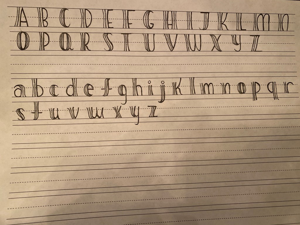
This was our final font. We are very happy with how it came out because not only does it fit the steampunk theme very well, we think it will fit the entire aesthetic of the book and grab the readers attention.

I really like the final draft! I think it is fun yet legible and definitely has a feminine touch while still keeping the steampunk theme. I also like the dots on the final draft. Great job!
LikeLike
Your design is very well thought out. I like the simplicity of it and that it is easy to read, while also giving off a fun and whimsical feel.
LikeLike