For the final draft of our story, we sifted through our photo collection and considered the possible stories arcs that they could create. While forging possible narratives, we were certain of the following details:
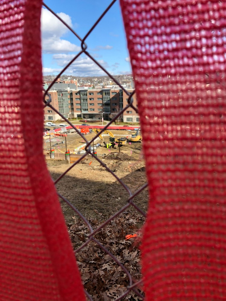
- Our story should start with a look at the “Smart World” construction site.
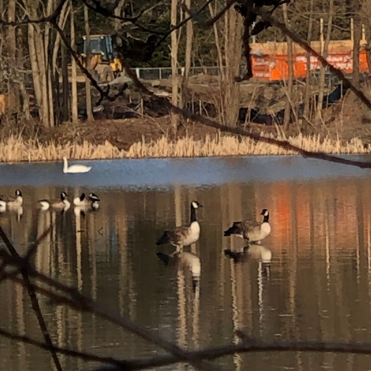
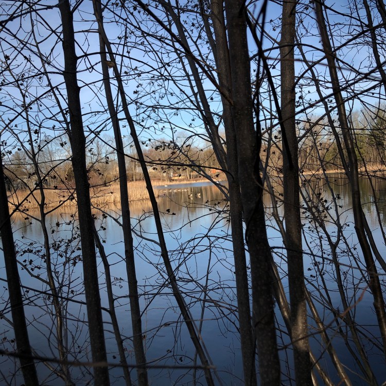
- Our story should end with a look of nature in Institute Park and Salisbury Pond.
- Our story should focus on the possible journey of pollution from the “Smart World” construction site to Institute Park and/or Salisbury Pond.
However, during this process, we were also unsure of the following details:
- How our story should illustrate the motion of pollution between our beginning and ending shot (erosion, runoff, soaking into groundwater, a mixture of the three).
- Ways that we could edit the photos through Adobe Photoshop that would emphasize the necessity for change without compromising the integrity of the photos.
In other words, we were certain of where we wanted the story to begin and end, but were also ensure of how to connect both points through a coherent story. To alleviate this issue, we itemized photos that could be used as our start point or our end point, chose which one would represent which point, and thought of common characteristics between both photos.
Another important set of parameters that we began brainstorming were the following:
- Audience: Our audience is the WPI community, with a focus on WPI staff that are in charge of organizing construction.
- Argument: WPI should slow down with its construction efforts and learn how to better utilize the space it currently has.
- Purpose: Our purpose in assembling our photograph story is to emphasize the dangers of construction pollution as well as the necessity of maintaining good water quality.
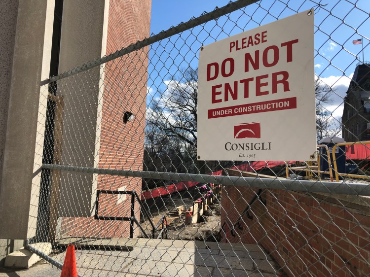
- How: We’ll achieve our purpose by creating a story that showcases the journey of water from the construction site to Salisbury Pond. Unfortunately, since we cannot trespass onto the construction site, it’ll be difficult to emphasize the negative impact of the construction on water quality without getting creative.
Categorizing our shots by story position and setting them up side-by-side provided clarity on common elements between both sets that we could emphasize as a common thread throughout the panels of our story. These elements include:
- Water
- Construction
- Nature (not focusing on water)
While assessing these three elements, we considered how enlisting them as our common element would benefit/hurt our story in terms of providing a profound look into water sustainability. Our thoughts on each entry were the following:
- Water: We decided that utilizing water as the main element of our photos would be the most efficient way of cementing water sustainability as the main focus of our story. It’d be easy to find natural shots of water (as it had rained right before our photo shoot) and manipulate our shots to suggest a natural motion between our three body shots. However, we also felt as though it’d be difficult to make a profound statement about water quality/sustainability with shots that merely showcased water as its main element. Consequently, we’d need to experiment with ways/layouts that would create meaning without distorting water’s place as our main element.
- Construction: We decided that utilizing construction as the main element of our photos would be the most efficient way of invoking an emotional response in our story. We rationalized this claim as juxtaposing construction sites with nature is an easy way to remind an audience of the life that populated a site before it was torn up. However, we also acknowledged the fact that it’d be tricky to incorporate this emotional response into a story about water sustainability.
- Nature: We decided that utilizing nature (not focusing on water) as the main element of our photos would be the most efficient way of establishing a solid character for our story. Here, we rationalized that an audience would likely have an easier time following a person, animal, etc through a story rather than a complex structure like a construction site or a minor structure such as a puddle of water. Even so, we also acknowledged that focusing on an individual “thing” in nature would make it difficult to make a profound story about water sustainability without adding on a significant amount of text.
With all of these ideas in mind, we ultimately decided that we’d enlist water as the main element of our photos. Among the three options, it felt like the most consistent option for establishing a dialogue around water sustainability through a photo story without muddling the story’s message. In accordance with this choice, we looked through photo options that showcase water in a significant way. After some sifting , we realized that this collection of photos could be separated into three categories:
As noted, we separated our candidates for our middle three shots into whether they were taken by the construction site, Salisbury Pond, or somewhere in between. This separation felt appropriate as it’d be an efficient structure to showcase the motion of water from the construction site to Salisbury Pond that our audience, the WPI community, would be familiar with, given some visual context. With five locations in mind as well as a main character in mind, we sifted through our overall photo collection and identified the following five shots for our story:
After selecting these five shots, we opened them up on Adobe Photoshop and experimented with ways to adjust their coloring and focus in a way that’d emphasize water where need be. The following collection is a draft of our story in which we adjusted colors of various objects in an attempt to put a greater emphasis on water and its quality:
While some of our coloration changes felt significant, none of them appeared to make a significant difference to water’s visual significance in the story. Instead, other elements of the photo, such as the red fence in the first panel, are enhanced and steal water’s spotlight. Since this wasn’t our intended purpose in editing our photos, we decided on taking a different approach. The following collection is the final draft of our story in which we decided to shift our focus from minor color changes in our photos to major changes in the saturation of specific parts of our photos:
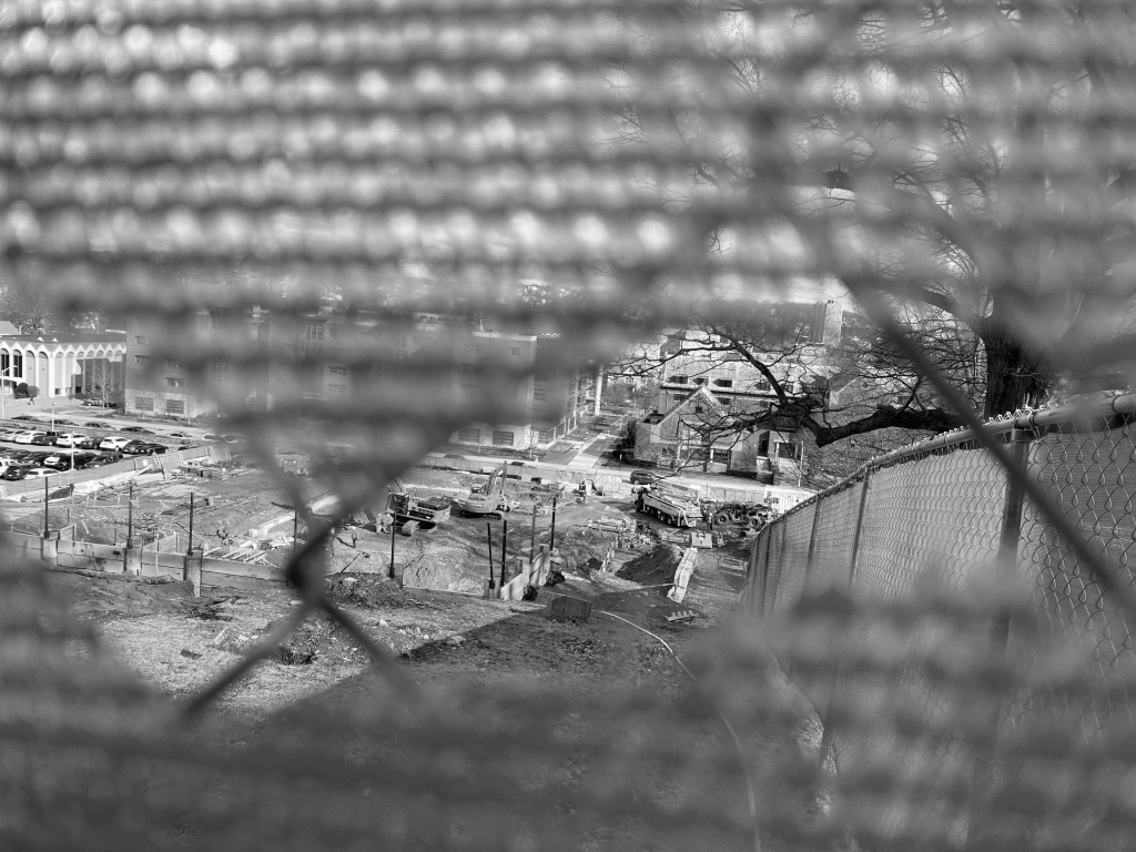
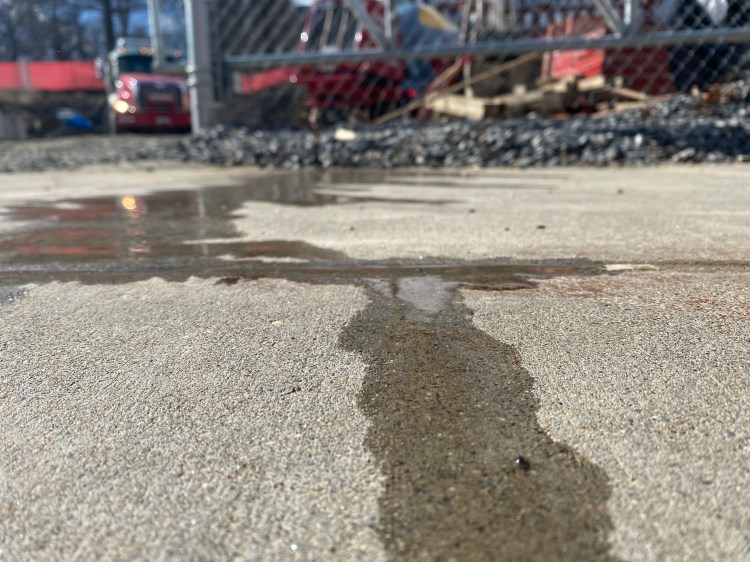
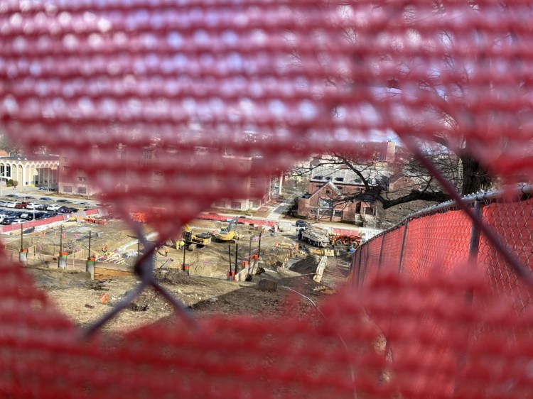
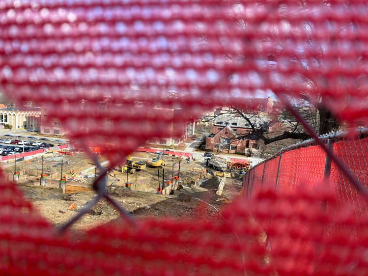
Construction found in a hole of truth: what is really hiding between the construction at WPI. 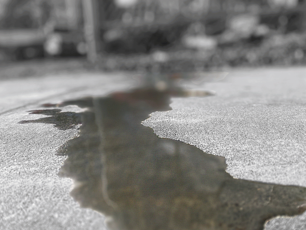
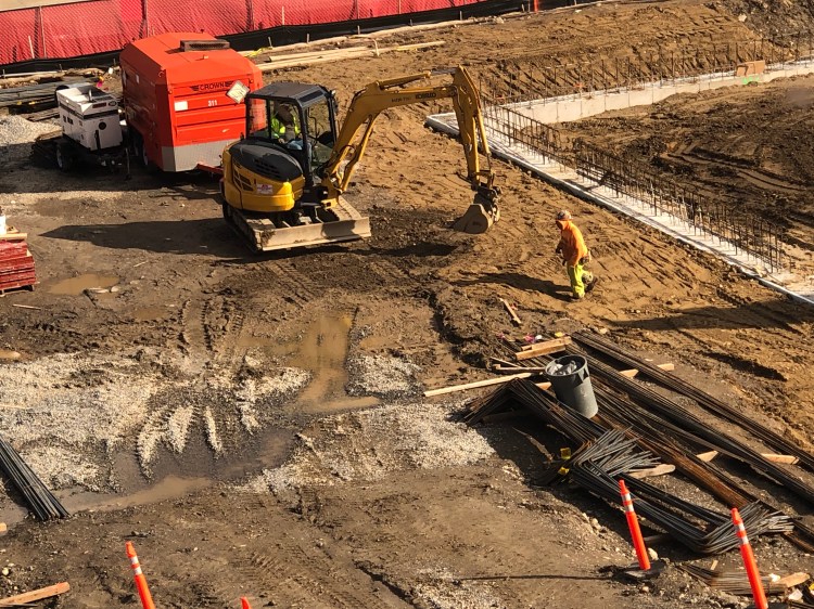
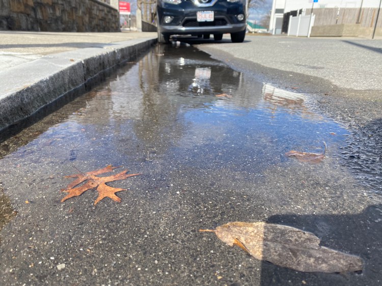
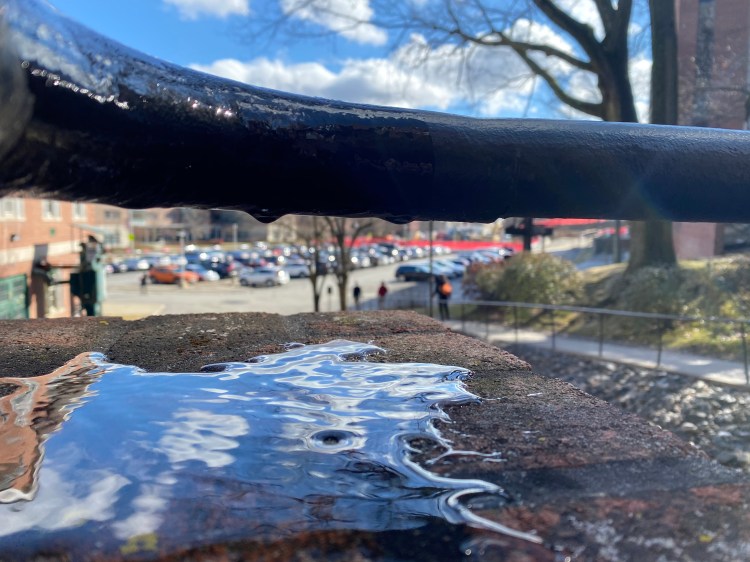
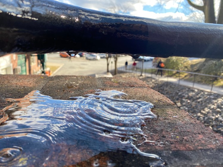
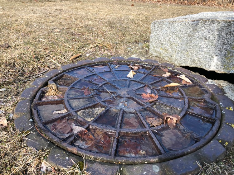
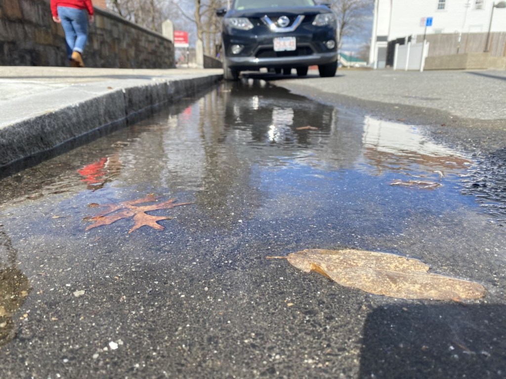
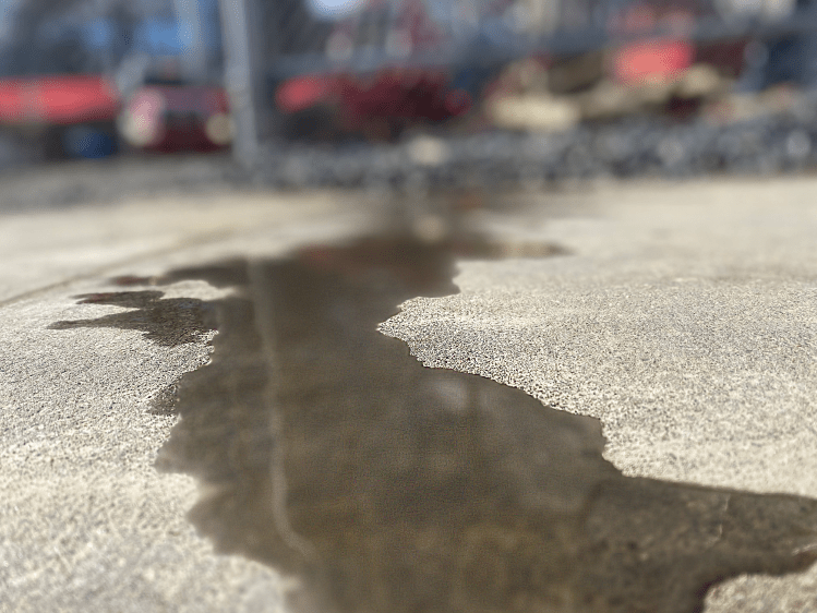
The close up effects on water leaking from the construction 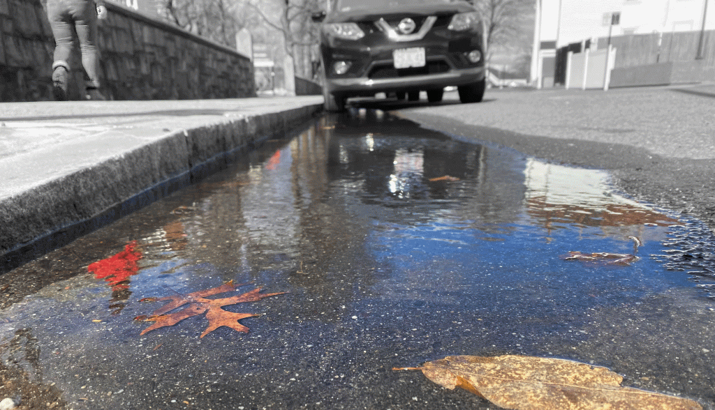
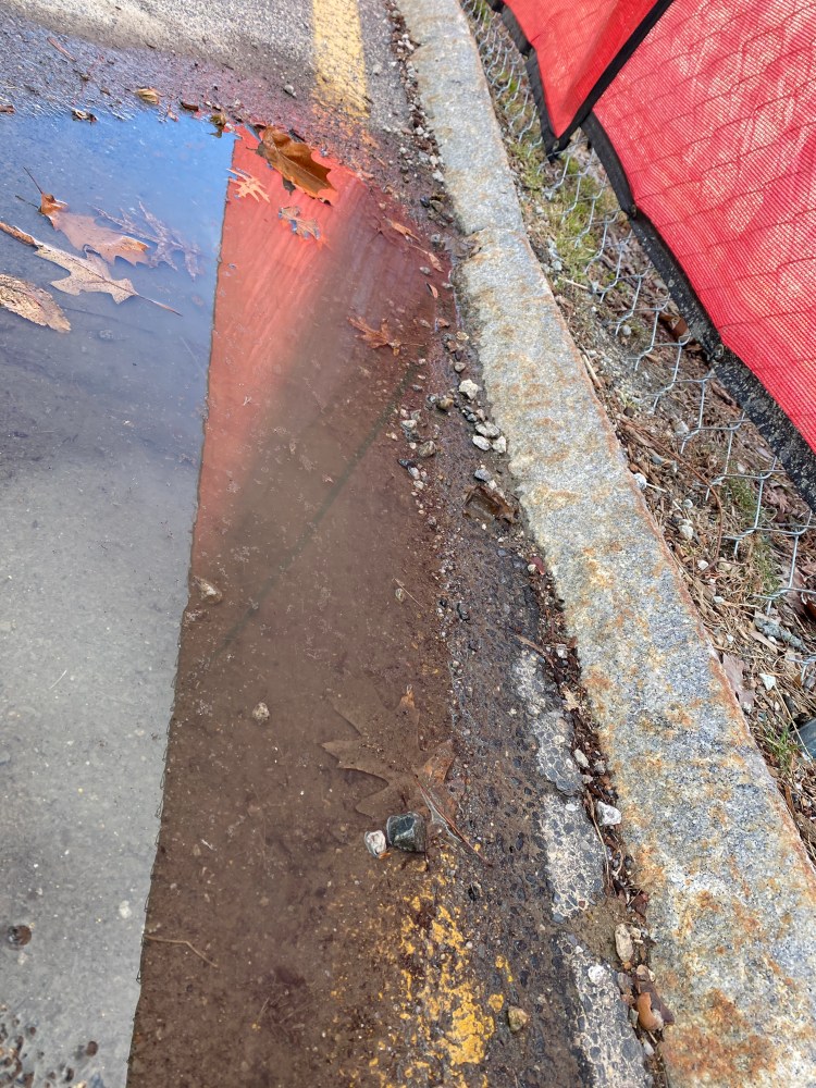
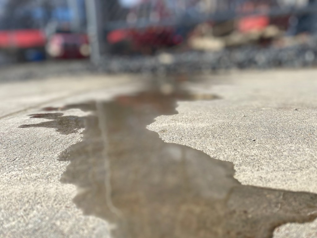
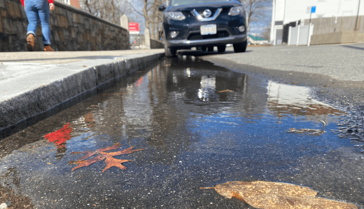
Water from WPI SmartWorld Construction leaving the campus 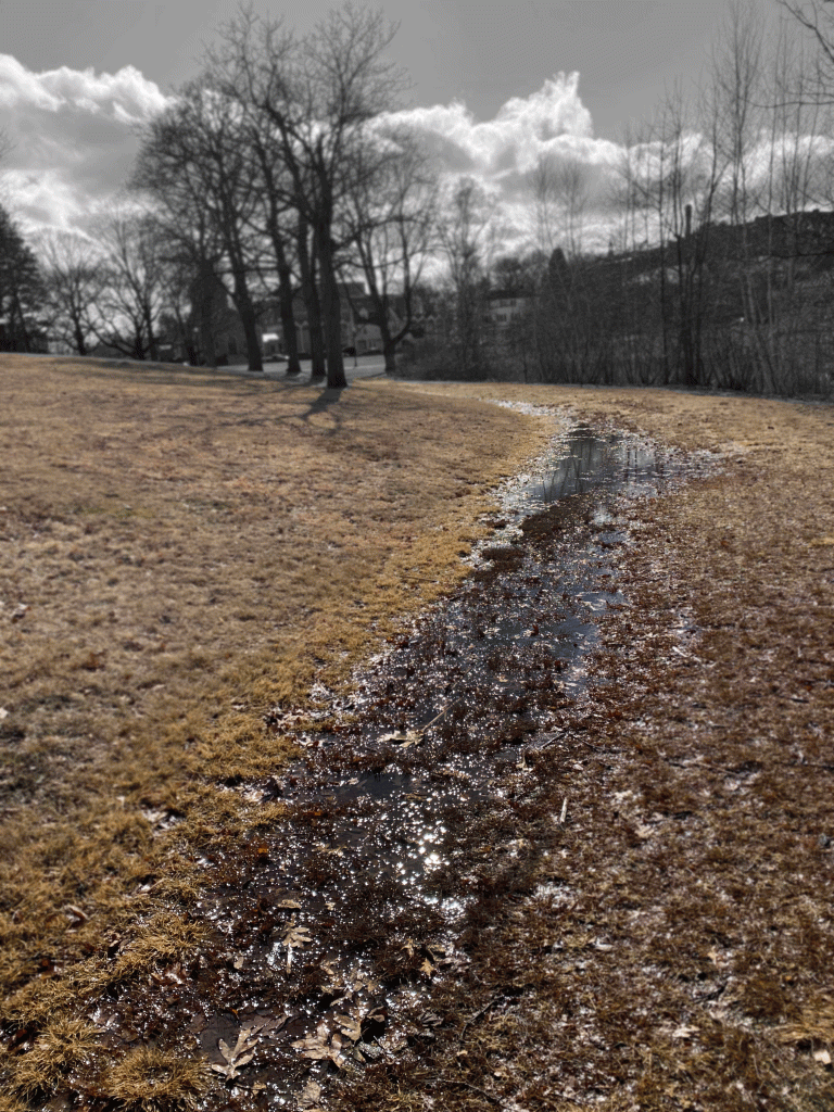
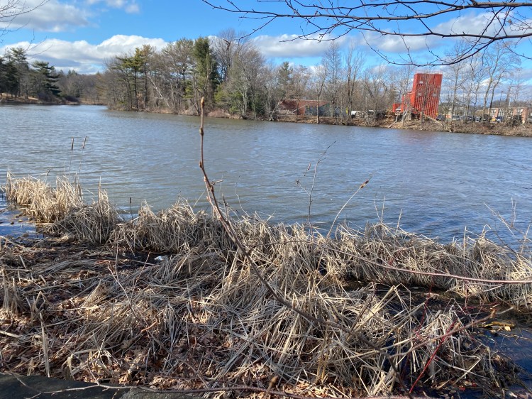
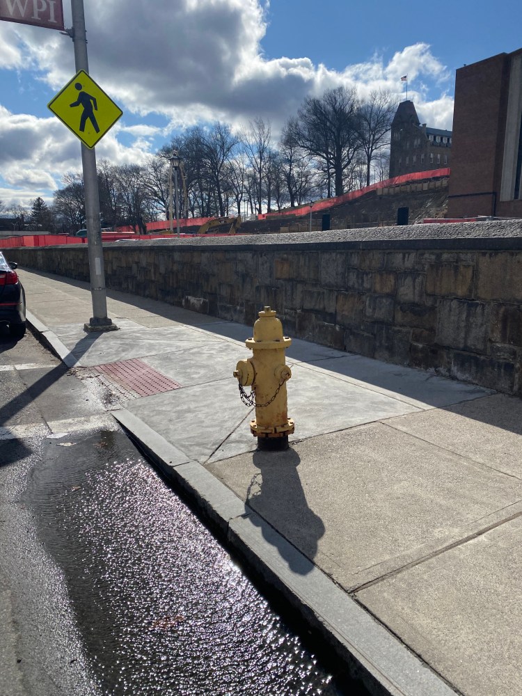
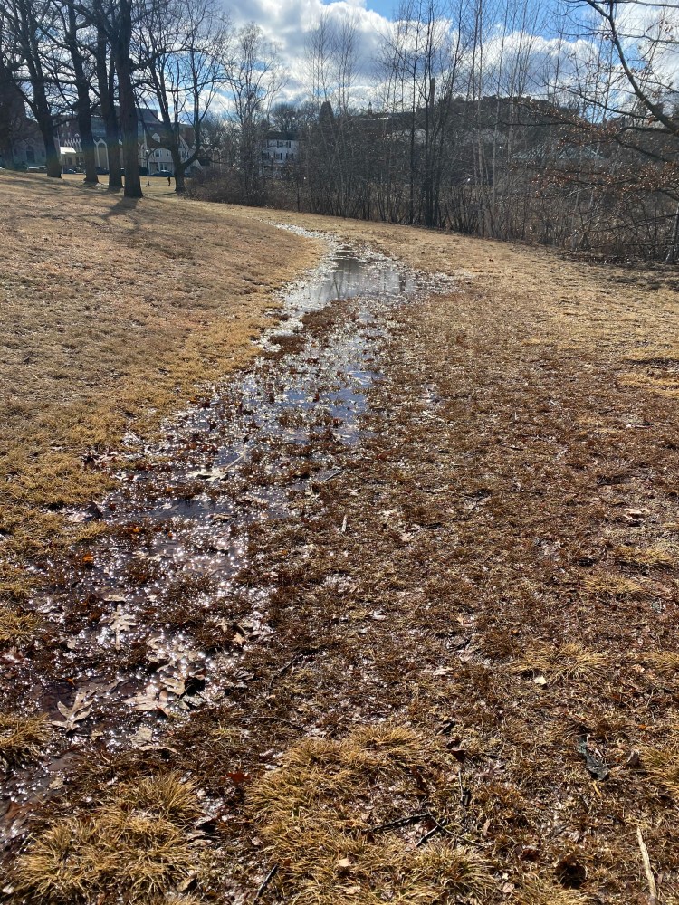
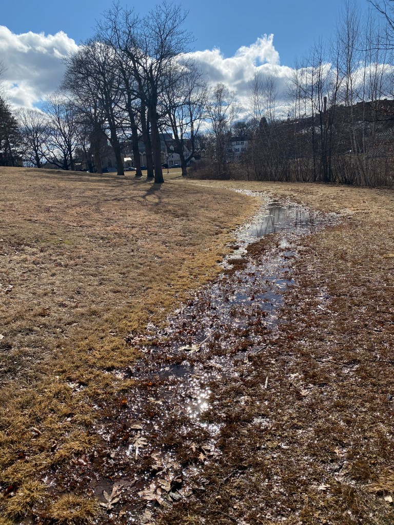
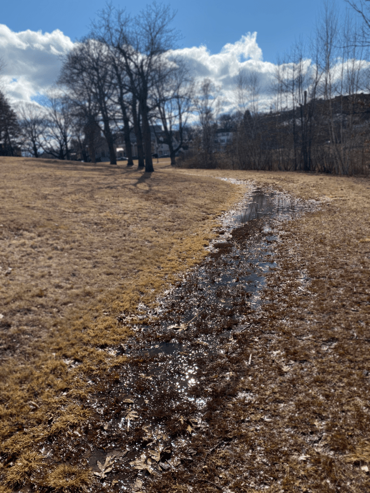
Dirty water seeping into soil at Salisbury pond 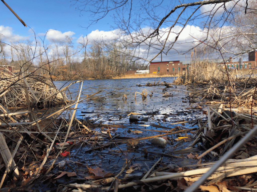
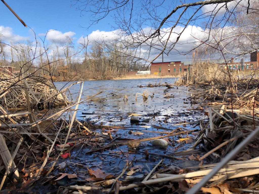
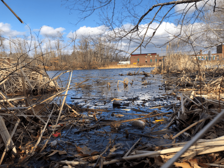
The dirty Salisbury pond: a direct effect from WPI
Our thought process behind cutting the saturation from certain elements in our photographs was to create an apparent juxtaposition between the first panel of our story, which illustrates the “Smart World” construction site, and our final panel, which illustrates Salisbury Pond. Between these two panels, our other photos become more much colorful as they transition from our initial panel to our final one. While we believe that this creates a progressive flow from colorless to colorful, we also wanted to establish a difference between WPI and the nature around it. Consequently, a majority of the elements that are WPI related are significantly unsaturated while water and non-WPI elements are left perfectly saturated.
If given more time to complete this project, we’d take the following actions:
- Find a creative and constructive way of showcasing bad water quality without tampering too much with the base shots.
- Highlight the “Smart World” construction site as the origin of said bad water quality and show a progression of water quality from the first panel to the final panel.
- Experiment with other methods that construction pollution can travel from one place to another.
