After we came up with our first draft, we presented it to the class to ask for comments and critiques. Many people liked our font because it was very pretty and unique. The font itself was very feminine, which would strongly appeal to the target audience of girls aged 5-9. Although there were many good aspects, there were also multiple concerns.
A major concern throughout the class was that the font did not really represent the steampunk theme that the book was centered around. Of course, this was a significant issue because we wanted the font to fit the theme of the book. Although our font looked very pretty, we needed it to satisfy the criteria of the producers and compliment the drawings. To incorporate this steampunk theme, we did more research on steampunk and specifically the Victorian era as it was inspiration for steampunk. We found that a significant component of the Victorian era were the corsets that women wore and the men with striped pants or coats.
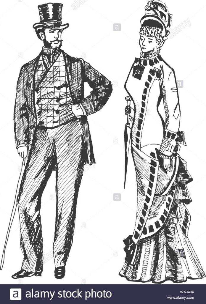
Our initial idea was to incorporate corsets and striped pants into all the letters, but we very quickly found out that it would be very difficult to keep a similar style to our first font and still incorporate these themes into every letter without overwhelming the reader. To adjust to this, we thought of adding these themes to only a couple of the letters. The only problem inconsistent letters was that it just did not look good. The letters that had the corset and ruffles theme appeared to be a completely different font than the ones that did not, so we had to adjust it again to make it one standard font that incorporated the steampunk theme.
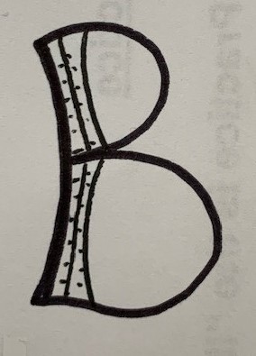
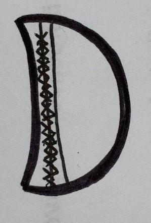
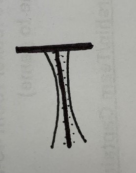
The first way we tried to change the font was by adding crossed lines that would symbolize the strings of the corset, in order to attempt to keep our initial theme but add a more steampunk accent. This idea did not work because the font became very hectic and objectively did not look good. A second way we tried to adjust it was by curving the edges of the lines to try and symbolize the curve of the corsets. In certain letters, like the D and the B, this shape looks really good, but in other letters like the T and the F it did not look too great. We are still deciding on whether we want to incorporate this into our font or not, or maybe just keep it for a few letters and not use it for others. A third idea we tried was adding dots next to the lines that would represent buttons. We really liked this idea because it kept our initial font that had the common Victorian theme of stripes, but by adding the buttons we made the Victorian theme stand out a little more.
“Steampunk Costumes, Clothing and Fashion.” Vintage Dancer, Restored 316, 2020, vintagedancer.com/steampunk/.


