Decisions, Decisions, Decisions
As the design process is slowly coming to an end, we begin to realize that it is time to have an idea on what our final font is going to look like, which means making crucial decisions so that we can spend time perfecting our font instead of constantly changing the details. The struggle we have been having is relevance to a steampunk theme and tying it to the Victorian era. We can not let the cover speak for itself because as Paul Gutjahr says in “Introduction: Reading the Invisible”: “literary texts are no less “marked” by their typography than more commercial 01 functional texts” meaning that if we pick a plain font, it will still send a boring message.
While trying to take the route of tying our font to the fashion of the era, we aren’t sure if out font is quite hitting the steampunk theme we are trying to convey. This post will focus on finding the flaws in our own design, as we search for solutions and ask for advice.
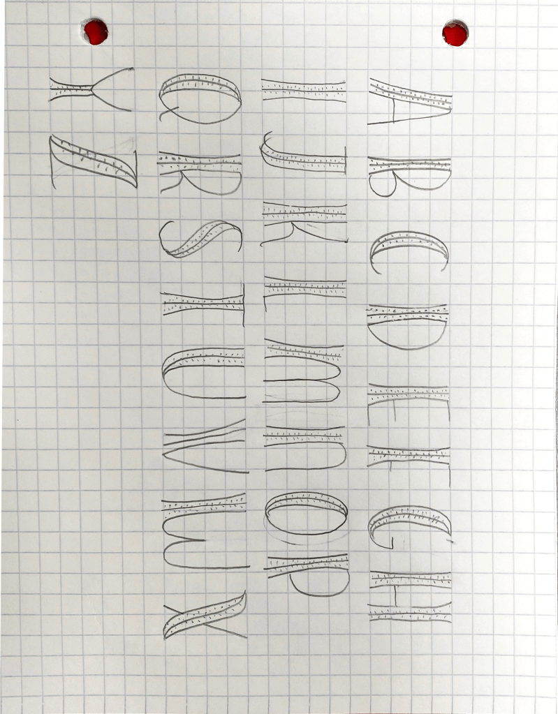
The font above represents our most recent draft and although it is obvious that it is a draft, it is a good representation of our recent ideas, as the corset shape is meant to symbolize the Victorian era.
Specific Details
One of the aspects of out font that we are unsure about is weather or not the dots (which are supposed to represents the loops of a corset” really serve that purpose, or if they are irrelevant and distract from the theme. The letters are going to be on a dark background, but the background of the cover page is an intricate picture with lots of details and the dots are likely to get lost in the background. On the other hand, delicate designs is a theme throughout the art of the storybook and big bulky letters do not fit the aura that the text gives off.
As you can see, the title above does have plenty of detail, so it is important to keep that in consideration when evaluating who meticulous the font should be.
We also had trouble getting specific letters to fit the corset theme. For example, letters that are curvy are less likely can not be curved even more to make a corset so to me, they look more like a watermelon. One idea was to make the letters less uniform and not introducing the corset theme into every single one, but we can not decide if that would be awkward. How can we incorporate the theme?
Final Thoughts
While we have some problems to solve, we feel confident in the direction we are going in. Since the criteria was so broad, there we many directions that we could have gone in and the direction we chose incorporate the audience and the steampunk theme that the authors intended. The next day we will take to finalize the font and really focus on the minute details to make it look finished and professional.
sources
Gutjahr, Paul C., & Benton, Megan L. (2001). Introduction: Reading the invisible. Paul C. Gutjahr and Megan L. Benton, Illuminating letters: Typography and literary interpretation (pp. l-l 1). Amherst: University of Massachusetts Press.

To answer your first question, I do not think that the details are too distracting. While the first idea that comes to mind for me is not specifically, “This looks like a corset,” I do enjoy the details in the font and think it provides an idea of well thought out intricate detail, much like the Victorian Era. I think that the details encapsulate the idea of the Victorian Era, and that they nicely compliment the feeling you wish the readers to have when reading the book. Particularly strong letters in my opinion are the C, the M, and the Q. However, I do have a question regarding your previous post in comparison to your current post. It appears that you changed the letters quite a bit in terms of the shapes of the letters. I am curious as to why. Now the B in your current draft appears to be more unbalanced than the B in your post prior to this one. I believe that because the shapes have changed in addition to how the details have changed, it influenced how the design is now perceived. I think making the letters full balanced vertically will help balance the details you are trying to add to your design. For example, having both loops in the B appear to be the same size rather than one loop being bigger than the other. A letter I think this is done particularly well in is the C, as the details are proportional to the strokes.
LikeLike
I like how your font is developing! An idea I have is to make the font mimic the illustrations in the book. For example, you could make the accent on the letters look similar to where the exterior of the castle is bolted together where the plates meet. This design is also seen on the interior walls and throughout the book!
LikeLike