For this project we were tasked to design a font that would serve on the cover of a children’s pop up story book called “Athena at Night”. The book was steampunk theme and written mostly for young girls as the plot includes a driven princess that escapes her way out of the castle. The final font that we chose to present is pictured below and we chose to call it spunk as a play on “steam punk”
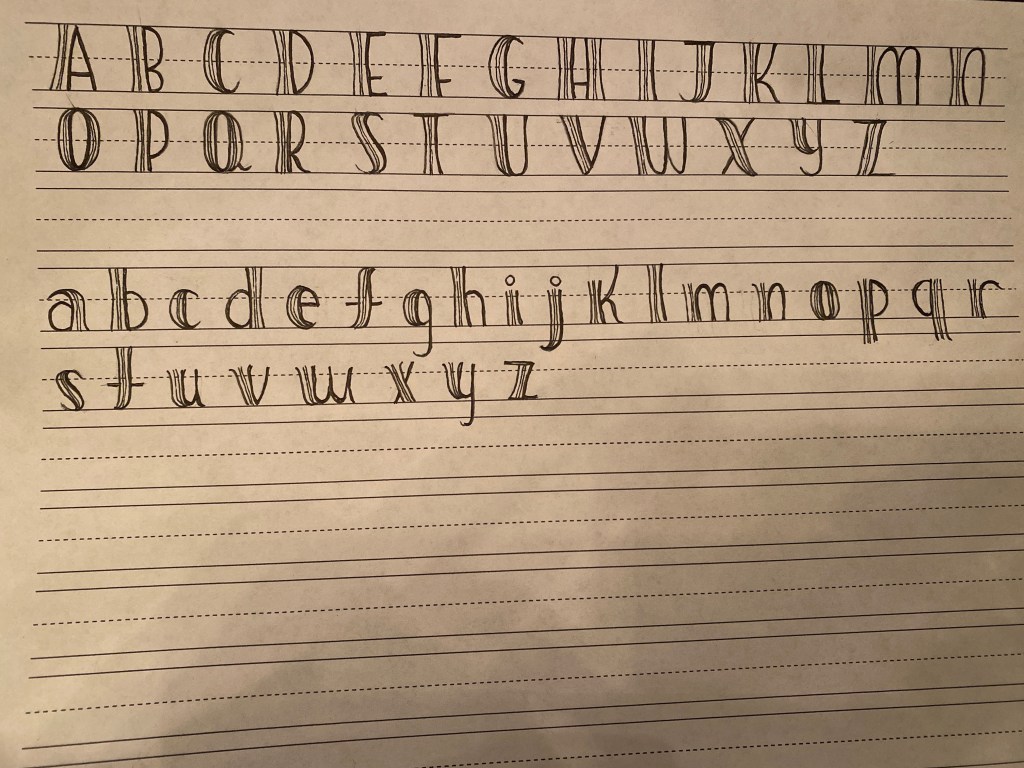
The font we chose was created to serve two main purposes: one being the audience of a female child from ages 5-9 years old, and the other being for the font to fit the steampunk theme. After making several conscious and purposeful choices we feel like our font truly fits on the cover page of “Athena at Night ”. The way we were able to entice the young female audience was through maintaining a more feminine font and trying to steer away from the obvious gears and bolts that could potentially be repelling to the audience. For this reason, we were forced to explore more representations of steampunk and specifically the Victorian era. After research, we found that we could use the fashion of the era in order to represent the steampunk theme. Specifically, we focused on the corsets that were worn by most women at the time, and stripes that were worn by both genders. We wanted to make sure that the font does not take away from the artwork of the cover page, but still fits into and alludes to the steampunk style. Therefore, we decided to make the thicker part of our letter shaped as a corset, meaning both sides would just slightly come in at the middle. In addition, we added two lines at the center of each letter to allude to the back of a corset where it comes together and the stripes that were worn at the time. This detail was chosen to be subtle because we did not want to turn our letters into corsets or specific clothing items because that is not the theme of the book and the connotation that corsets have today does not apply to the audience of the storybook. Still, by adding these subtle yet considerate details our font is able to add to the steampunk/victorian aura without the it being a distracting element. Other purposeful decisions we made included slightly bolding the base of the letter and drawing the font by hand. We chose to bold the letters so that from far away, the letters were still easily visible and so that children had an easier time differentiating between them since their reading skills at the target age are still inadequate. The letters were hand drawn to match the style of the art work in the book. Although the artwork was made on a computer, it was still hand drawn and it was clear that the images were not computer generated. Since we did not have the resources of an electronic pen, we believe drawing the font has the same effect where the letters look slightly more ragged and authentic. Overall, we are very happy with our final design and feel as if the font truly fits the criteria that the authors were looking for.
