After we came up with our first draft, we presented it to the class to ask for comments and critiques. Many people liked our font because it was very pretty and unique. The font itself was very feminine, which would strongly appeal to the target audience of girls aged 5-9. Although there were many good aspects, there were also multiple concerns.
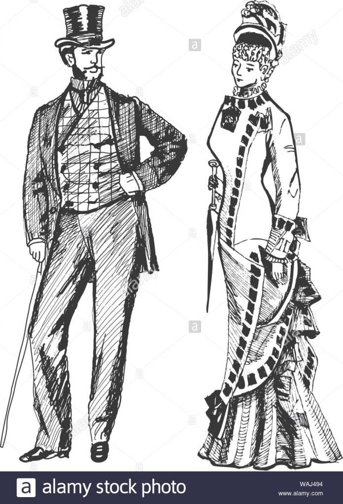
A major concern throughout the class was that the font did not really represent the steampunk theme that the book was centered around. Of course, this was a significant issue because we wanted the font to fit the theme of the book. Although our font looked very pretty, we needed it to satisfy the criteria of the producers and compliment the drawings. To incorporate this steampunk theme, we did more research on steampunk and specifically the Victorian era as it was inspiration for steampunk. We found that a significant component of the Victorian era were the corsets that women wore and the men with striped pants or coats.
Our initial idea was to incorporate corsets and striped pants into all the letters, but we very quickly found out that it would be very difficult to keep a similar style to our first font and still incorporate these themes into every letter without overwhelming the reader. To adjust to this, we thought of adding these themes to only a couple of the letters. The only problem inconsistent letters was that it just did not look good. The letters that had the corset and ruffles theme appeared to be a completely different font than the ones that did not, so we had to adjust it again to make it one standard font that incorporated the steampunk theme.
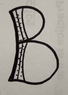
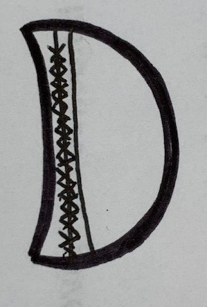
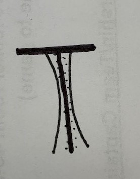
The first way we tried to change the font was by adding crossed lines that would symbolize the strings of the corset, in order to attempt to keep our initial theme but add a more steampunk accent. This idea did not work because the font became very hectic and objectively did not look good. A second way we tried to adjust it was by curving the edges of the lines to try and symbolize the curve of the corsets. In certain letters, like the D and the B, this shape looks really good, but in other letters like the T and the F it did not look too great. We are still deciding on whether we want to incorporate this into our font or not, or maybe just keep it for a few letters and not use it for others. A third idea we tried was adding dots next to the lines that would represent buttons. We really liked this idea because it kept our initial font that had the common Victorian theme of stripes, but by adding the buttons we made the Victorian theme stand out a little more.
“Steampunk Costumes, Clothing and Fashion.” Vintage Dancer, Restored 316, 2020, vintagedancer.com/steampunk/.

Great evolution here. This definitely represents the Victorian Era. It’s simple, readable, and has alot of character. I think this would fit well with the time period Athena At Night takes place in.
LikeLike
I liked how the step 2 post was in response to what was critiqued in step 1. I think you both did a very good job in reflecting on your feedback and showing how your design was improved. I would recommend introducing the book or story line and purpose of designing the font sooner. It felt like you were withholding information in your initial post.
LikeLike
Although some people had problems with there being not enough steampunk in your first font, I liked the contrast as your first font was very girly and fit with the target audience. Maybe you could find a way to mix your two ideas into one!
LikeLike
I think this is a really interesting idea! It incorporates the Victorian theme, while still keeping its feminine touch. I agree that the T doesn’t quite fit. Maybe you could see what it looks like if you incorporated some of the early designs with these new ones? Having some letters with more simple stripes, and others with the dots or crossed lines as elements?
LikeLike
I like seeing your captions on the images. I enjoyed your discussion about why you shaped your letters in a certain way and why you discarded one idea or another.
LikeLike
I think you guys are on a great track by adding these details to incorporate a more illustrated steampunk/Victorian theme! There was also a great job of incorporating a more Victorian theme by adding these details to the letters, they feel well throughout out and intricate, similar to how a corset or blazer is like. I am also very fond of the illustration of the letters, and how there are truly no straight lines in the letters. It makes it appear to be very playful and feminine, but not too much that it is only one sided. I think that the details are a great touch to your font and I wish we were able to see it play out in more letters. I like the B and D, but I also think that the T looks good too. I can understand how it may look a little odd in comparison but I wonder if you made the horizontal line in the T a curved line and added details to that instead if it would make a difference. Potentially keeping the details in similar placements in each letter and providing a consistent theme throughout them would help add to its cohesiveness and make all the letters look unified. For example, try keeping a theme of only having curved lines, only one line of each letter will hold the details, etc, to help bring an understated but intentional design decision to help the balance in the letters.
LikeLike
I appreciate how adventurous your font has gotten since it was last presented in class. While you did begin with a solid base, it’s interesting to see how much you’ve considered and explored differing elements of victorian culture and seeing how much character it gives to your font. Considering the fact that most groups appear to have taken the steampunk route of gears and tools, seeing your design is a nice pallet cleanser that I’m sure the customer is bound to appreciate!
LikeLike